 Go up
Go up


Visualizing Brand Preference: Mayonnaise
Posted on May 10, 2016 by Admin
One benefit of data and applications like SimplyMap is the ability to visualize information. In this week’s report, we’ll take a quick look at some branding preferences in contiguous America using data from the SimmonsLOCAL data set. As a reminder about the dataset, Experian SimmonsLOCAL is a powerful targeting and profiling system that provides insights into consumer behavior for all of America's 210 media markets on a local level with 60,000+ data variables, including over 450 categories and 8,000 specific brands.
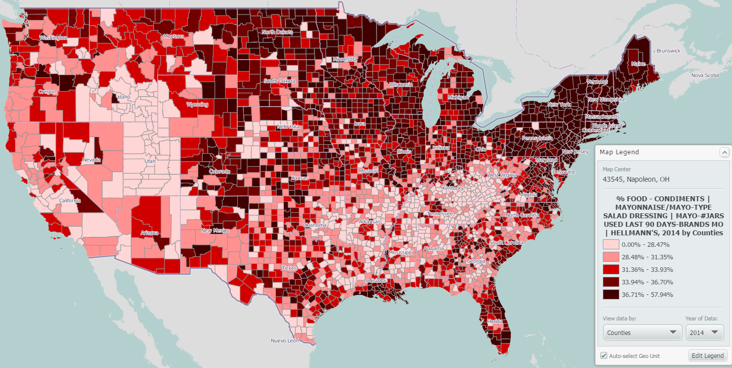
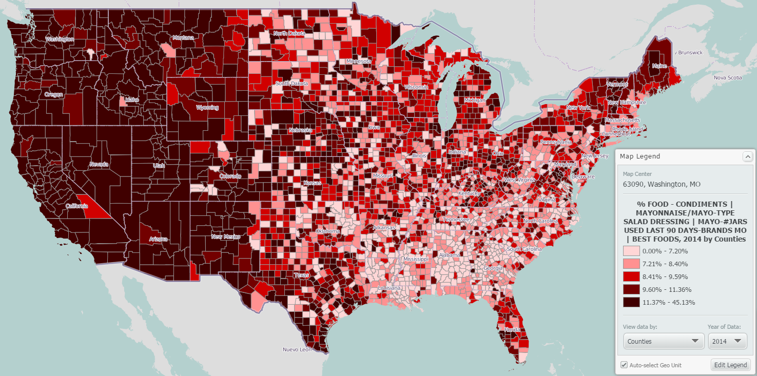
With that said, let’s visualize the brand preferences of mayonnaise (we’ll use Hellmann’s, Best Foods and Miracle Whip) across the United States to see if we can identify some obvious trends in preferences relative to geography.
Quick side note: out of curiosity, we decided to run a search for the word “mayonnaise” to see how many related variables exist in SimplyMap. That total? 202! On to our maps:
HELLMANN’S
BEST FOODS
Miracle Whip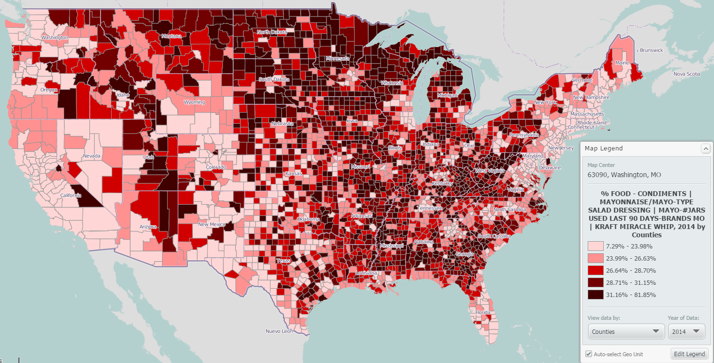
So what exactly do these three maps tell us? In effect, it allows us to draw three conclusions:
1. Miracle Whip dominates the midwest and deep south, while the northeast and west coasts don’t have a taste for it.
2. The northeast loves their Hellmann’s.
3. West of the rockies is Best Foods mayonnaise territory, which as we understand is actually Helmann’s mayo. Per Wikipedia: The Hellmann's brand is sold in the United States east of the Rocky Mountains, and also in Latin America, Europe, Middle East and Canada. The Best Foods brand is sold in the United States west of the Rocky Mountains, and also in Asia, Australia, and New Zealand. This also explains the extremely divided map shown above.
Think of the potential this data can have for marketers and researchers across the country (8,000+ specific brands!). If you feel your institution can benefit from SimplyMap, feel free to email or call us - we’d be happy to set up webinars at your convenience.
More from SimplyAnalytics


Posted on Feb 26, 2014 by Admin
The Statewide California Electronic Library Consortium is holding another packed week of workshops and networking during the SCELCapalooza event in March 2014. Geographic Research will b...
Posted on Jan 27, 2015 by Admin
In this week’s report exploring SimplyMap data, we take a look at where America’s bookworms reside. To find this data, we used the variable, Reading (Household Average), 2014 found in the...
Posted on May 06, 2013 by Admin
The GRI team is looking forward to exhibiting at SLA 2013 at the San Diego Convention Center, June 9th through the 11th. The Special Libraries Association (SLA) is a nonprofit global orga...
Posted on Apr 18, 2008 by Admin
A team of librarians at Drexel University has developed a detailed poster to introduce SimplyMap as a new research tool for the student body. The poster was launched on Drexel Research Da...
Posted on Jun 01, 2014 by Admin
Visit the SimplyMap team at the ALA Annual Conference and Exposition in Las Vegas later this month. We will be at booth 1271, offering product demonstrations, tips & tricks, and of co...
Posted on Mar 22, 2016 by Admin
Inspired by some recent support desk questions, this week’s SimplyMap report will provide some useful tips and tricks to help make the most out of your maps. Let’s get started! First, let...
Posted on Jan 29, 2016 by Admin
In a previous blog entry, we highlighted the benefits of having multiple years of data available for the same variable. This allows users to identify trends over time. Keeping with the sa...
Posted on Oct 22, 2008 by Admin
Excerpt from University of Iowa Library blog: In your marketing class, you may be developing a marketing plan for a pre-made meals restaurant specializing in vegetarian menus in Chicagola...
Posted on Jun 21, 2022 by Admin
Hello readers! We hope you’re having a great day. Today we are featuring 5 commonly asked questions about the American Community Survey dataset that’s available to all customers in Simply...
Posted on Nov 11, 2015 by Admin
Inspired by a recent help desk ticket, we wanted to discuss how users may utilize SimplyMap to identify relationships between unique variables. For example, does having a college degree s...