 Go up
Go up


Visualizing Preferences in SimplyMap: Credit Cards
Posted on Jun 02, 2016 by Admin
Three weeks ago we utilized the SimmonsLOCAL data set to visualize contiguous America’s mayonnaise brand preference. Staying with the American visualization theme, this week’s report will map the US as it relates to the brand of credit card they own.
To create these maps, we tapped into the Nielsen Financial CLOUT data package. Nielsen Financial CLOUT is a database that contains current year (CY) and five year (FY) projections of market penetration and dollar balances for more than 100 financial products. These modeled estimates and projections include all basic banking products and auxiliary services, such as checking accounts and bill pay, and other services, such as investments and retirement accounts.
The four mapped % Households Owning variables can be found at this path in SimplyMap: Financial CLOUT » Credit Card Products » Bank Credit Card Products
American Express Blue/Clear/Co-branded Card
MasterCard
Discover Card
VISA Card
American Express Blue/Clear/Co-branded

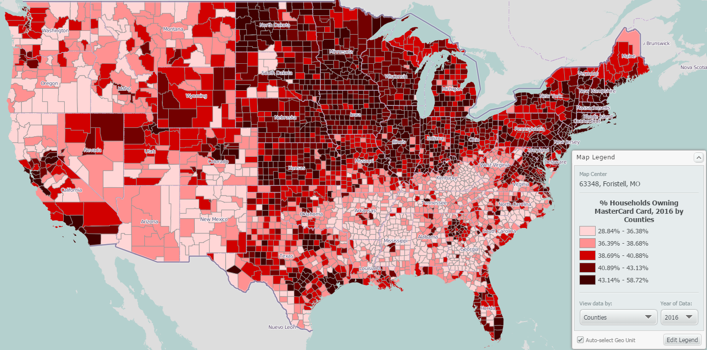
MasterCard
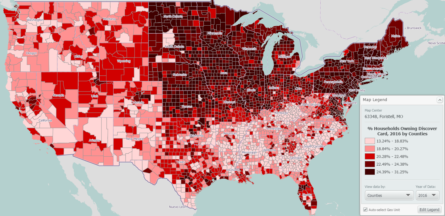
Discover Card
Visa

Some interesting points to note from this data:
1. American Express Blue/Clear, while the least popular card overall has concentrated ownership towards the western US.
2. Visa appears to be the most popular card (using the legend as reference).
3. The rural southern US counties tend to rank among the lowest in credit card ownership.
4. The northeast ranks among the higher counties across all credit cards.
Comparing the data across the US at large reveals the following:
% Households Owning American Express Blue/Clear/Co-branded Card - 14.63%
% Households Owning Discover Card - 21.51%
% Households Owning MasterCard Card - 42.46%
% Households Owning VISA Card - 58.30%
We hope you enjoyed this week’s SimplyMap report - stay tuned for more!
More from SimplyAnalytics


Posted on May 06, 2016 by Admin
Visit us at booth #775 at the ALA 2016 annual conference to meet the SimplyMap team and learn more about the features and functions behind SimplyMap. Have a Ghirardelli Chocolate while we...
Posted on Sep 07, 2011 by Admin
Geographic Research will be exhibiting and presenting during a vendor showcase session at the upcoming North Carolina Library Association (NCLA) Biennial Conference, October 4-7, 2011 in ...
Posted on Nov 06, 2019 by Admin
Hello readers! We hope you’re having a wonderful week. Today we feature another entry from our From the Help Desk series. Let’s get started! Question: How do I analyze data for downtown? ...
Posted on Oct 12, 2010 by Admin
NC LIVE, a member-driven library service organization dedicated to providing online information services that support education, enhance statewide economic development, and increase qu...
Posted on Dec 19, 2016 by Admin
Stop by the Geographic Research booth [#T8] at the Ontario Library Association Super Conference to get a hands-on look at our latest and greatest SimplyMap offering. The conference will t...
Posted on Jul 09, 2009 by Admin
The American Library Association 2009 Annual Conference will take place in Chicago, IL from July 9- July 15, 2009 at McCormick Place West located at 2301 S. Lake Shore Drive Chicago, IL. ...
Posted on Feb 27, 2009 by Admin
Geographic Research, Inc. is pleased to participate in the Statewide California Electronic Library Consortium's (SCELC) 12th Annual Vendor Day. SCELC members and librarians from other aca...
Posted on Oct 23, 2009 by Admin
SimplyMap was highlighted in the Wake County, NC Public Library Business Blog today as a valuable tool for business planning. Wake County has access to SimplyMap through NC LIVE, a statew...
Posted on Feb 24, 2019 by Admin
We will be exhibiting at SCELC* Vendor Day on March 14th. Visit us at table 510 and attend one of our two sessions demonstrating SimplyAnalytics. The presentations will highlight newly av...
Posted on Apr 30, 2024 by Admin
Congratulations to Brandyn Whitaker as the recipient of the 2024 BRASS Student Travel Award! Brandyn is a Library Services Associate in the Workforce and Economic Development department a...