


From the Help Desk - Legend Classification Methods
Posted on Sep 27, 2019 by Admin
Hello readers! This week we provide an in-depth response to a question asking about the legend classification methods in SimplyAnalytics. This response is now part of our Help Center: https://simplyanalytics.zendesk.com/hc/en-us
Question: Can you explain the legend classification methods?
The classification method controls how the data in your map is grouped. Areas on the map are assigned to groups using different classification methods. The colors you see on the map depend on which class is assigned to each area.
There are multiple methods for calculating break points for the data. You can select any of the following from the Classification Method menu:
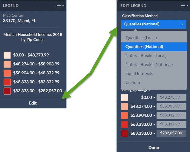
- Quantiles (Local)
- Quantiles (National)
- Natural Breaks (Local)
- Natural Breaks (National)
- Equal Intervals
- Custom
Quantiles (National): This is the default method used to classify each area on the map, and works for most situations. Breakpoints are calculated so that each category contains about the same number of features. "National" uses a sample of locations from throughout the USA to calculate the breakpoints.
Example: If there are 35,000 ZIP Codes nationally and you have 5 categories the legend is calculated so there are theoretically 7,000 ZIPs in each category.
Quantile classes are easiest to understand, but they can be misleading if the data being mapped is not distributed normally. For example, population counts are usually not suitable for quantile classification because only a few places are highly populated. Use population density or percentages for more meaningful maps.
Quantiles (Local): Breakpoints are calculated so that each category contains about the same number of features. "Local" uses a sample of locations from your current view to calculate the breakpoints. This method usually ensures the map will show more colors. For example, if there are 50 ZIP codes visible on your map, and you choose to display them in five classes, the map will show 10 ZIP codes per color.
Natural Breaks (National): Breakpoints are calculated using a statistical formula that finds groupings and patterns in the data. "National" uses a sample of locations from throughout the USA to calculate the breakpoints.
Natural Breaks (Local): Breakpoints are calculated using a statistical formula that finds groupings and patterns in the data. "Local" uses a sample of locations from your current view to calculate the breakpoints.
Equal Intervals: This method uses equal-size intervals for each class and color on the map. Breakpoints are calculated so that each category has the same range. This method doesn't care if all areas on the map end up sharing the same color.
Example: if the lowest value nationwide is 1 and the highest value is 100 for that specific geography the legend will have 5 equal categories 1 to 20, 21 - 40, 41 - 60, 61 to 80 and 81 to 100
Custom: The user selects their own breakpoints by typing in their own values.To set your own custom breakpoints, you can click in each value’s cell and enter a value of your choice. You can also click the colors to customize how the map looks.
More information on data classification/reference:
https://gisgeography.com/choropleth-maps-data-classification/
More from SimplyAnalytics
Posted on Dec 02, 2014 by Admin
Today we take a look at one of the more advanced features in SimplyMap - editing the map legend. Editing the map legend is a great way to not only customize how the data is distributed on...
Posted on Apr 05, 2019 by Admin
Come visit the SimplyAnalytics booth (325) at the upcoming ACRL 2019 show in Cleveland! Say hello, grab a chocolate, and stay for a quick demo of SimplyAnalytics. The team will be showcas...
Posted on Oct 29, 2015 by Admin
Did you know that SimplyMap allows you to search for businesses by NAICS or SIC codes? Searching by these codes is a great alternative to the general keyword search. Using the keyword sea...
Posted on Apr 18, 2017 by Admin
We look forward to attending the Texas Library Association Conference this week in San Antonio and visiting with the library community. Stop by our new SimplyAnalytics booth (2029) and ta...
Posted on Dec 06, 2009 by Admin
ALA's Choice Magazine, publisher of independent reviews of products and services for academic libraries, released a new review of SimplyMap in the December 2009 edition. The reviewer, Car...
Posted on Aug 30, 2009 by Admin
Jeff Zaslow, Wall Street Journal columnist and co-author of the The Last Lecture, will speak at the Orlando, FL Public Library on Friday, September 11 at 7 p.m. Zaslow helped the late Ran...
Posted on Jun 21, 2022 by Admin
Hello readers! We hope you’re having a great day. Today we are featuring 5 commonly asked questions about the American Community Survey dataset that’s available to all customers in Simply...
Posted on Apr 30, 2008 by Admin
Doreen Harwood, Business Librarian from the University of Washington has developed a series of detailed tutorials on using SimplyMap. The tutorials, which are Flash-based and interactive,...
Posted on May 28, 2009 by Admin
The Charleston Advisor, which publishes critical reviews of online resources for libraries, published a review of SimplyMap in April. We are very pleased to have received 4 1/4 stars out...
Posted on Nov 11, 2015 by Admin
Inspired by a recent help desk ticket, we wanted to discuss how users may utilize SimplyMap to identify relationships between unique variables. For example, does having a college degree s...