


SimplyMap 3.0 Tip - Using the Data Filter
Posted on Oct 24, 2014 by Admin
At times it can be useful to apply filters to the data in SimplyMap as a means of focusing on specific characteristics, or preforming a query. For example, a map showing household income levels by ZIP Code could be filtered to only show ZIP Codes with income over a specific threshold.
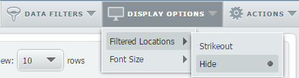
Filters can be applied to any map or report. When a filter is applied to a report, the locations that do not meet the filter criteria can be stricken out in the report, or hidden entirely. Let’s look at an example.
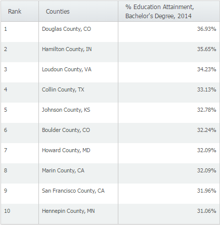
If you run a ranking report for counties in the US with the most residents possessing a Bachelor’s degree, you will see the following:
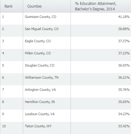
It turns out that the counties with the highest percentages of college graduates are found in lower population counties- Gunnison County, CO for example only has a population of 15,507. In order to analyze this data for larger population counties, we can apply a Data Filter. Here’s how:
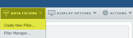
1. From the Data Filters menu near the upper right corner of the window, select Create New Filter.
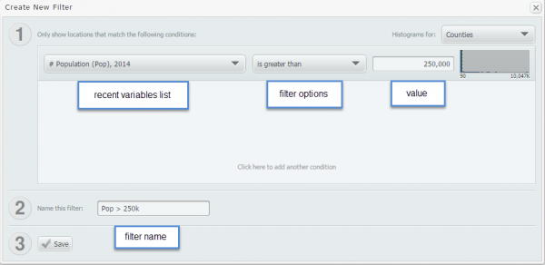
2. The Create New Filter window will pop up. Select a recent variable, filter option, set a value for the filter, and provide a descriptive name.
3. After you select save, you’ll see a list of counties that meet your new criteria.
Below is the new list of counties (> 250,000 population) with the highest % of bachelor’s degrees.
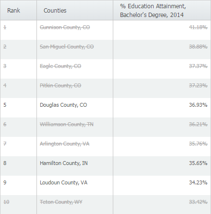
You may see a list of areas listed with a line through the middle to indicate the county has not reached your criteria (shown above). If you’d prefer to not see them at all, the display options menu has an option to hide them altogether.
Here is what the results would look like if we hid those counties.
More from SimplyAnalytics
Posted on Feb 05, 2015 by Admin
Our Winter Sweepstakes has begun! Enter to win an iPad Mini 3 or Kindle Fire. How to Enter: Follow @SimplyMap on Twitter Like our SimplyMap Facebook Page for a 2nd Chance to Win If you ...
Posted on Jun 25, 2015 by Admin
In this week’s SimplyMap report, we review the different options available when searching for a business. The easiest and fastest method of mapping businesses or creating a business repor...
Posted on Feb 16, 2009 by Admin
Men's Health conducted their first survey of America's recycling habits, and used SimplyMap in their research. Here’s how the editors explain their methodology: To determine how well citi...
Posted on Dec 19, 2016 by Admin
Stop by the Geographic Research booth [#T8] at the Ontario Library Association Super Conference to get a hands-on look at our latest and greatest SimplyMap offering. The conference will t...
Posted on Oct 26, 2018 by Admin
Welcome readers! This week we’ll take a look at how to browse for data by category in SimplyAnalytics. Browsing by Category is the default way of browsing for data in SimplyAnalytics. It ...
Posted on Nov 06, 2014 by Admin
With over 75,000 variables in SimplyMap, you can find virtually any information you want. This week, we take a look at which U.S. locations spend the most money eating at restaurants or c...
Posted on Jan 27, 2015 by Admin
In this week’s report exploring SimplyMap data, we take a look at where America’s bookworms reside. To find this data, we used the variable, Reading (Household Average), 2014 found in the...
Posted on Nov 20, 2015 by Admin
In a previous blog we demonstrated the power of utilizing multiple years for the same variable. We found that the usage of Amazon.com had grown substationally from 2008-2014. In this week...
Posted on May 26, 2020 by Admin
Hello readers! We hope you are doing well, and thank you for your continued support of SimplyAnalytics. We are excited to announce that scatterplots are officially live! Scatter plots ar...