


Introducing Scatter Plots
Posted on May 26, 2020 by Admin
Hello readers! We hope you are doing well, and thank you for your continued support of SimplyAnalytics. We are excited to announce that scatterplots are officially live! Scatter plots are a great way to visualize the relationship between two different data variables, and we know you will enjoy them as much as we do.
Let’s take an in-depth look at this new feature.
What is a scatter plot?
A scatter plot is a graphical representation where the values of two data variables are plotted along the x and y axis. Each dot represents both the x and y values for a single location, such as a ZIP Code or county.
Why use a scatter plot?
Scatter plots enable users to identify correlations between two different variables. Let’s take a look at an example below using SimplyAnalytics where we’ll use the % of Adults (25+) with a college degree and Median Household Income to see if there’s a correlation between the variables for Counties in the USA.
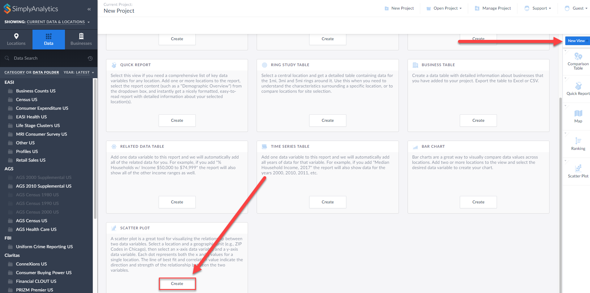
Getting Started
First, click on New View > Create under the Scatter plot option:
The Edit View page displays your data variables and locations in the project.
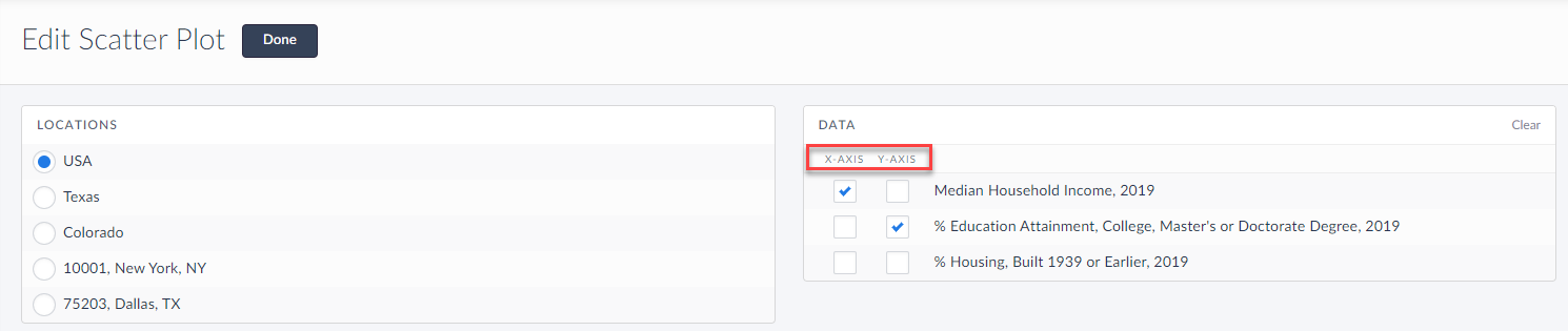
Here you can choose which data variables to display along which axis. Of course, this can be edited directly on the scatter plot as well, but for now, select Done to generate the scatter plot.
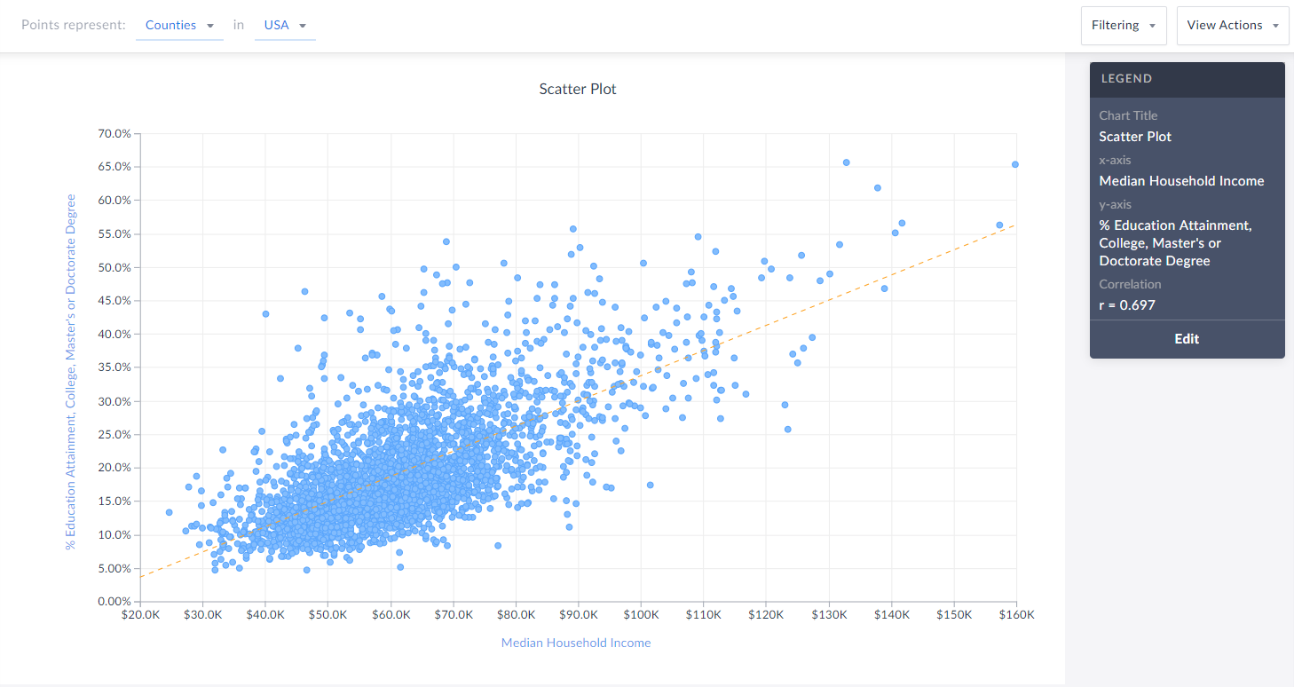
Voila! Your first scatter plot is created. Now, what exactly is this showing?
The top of the view explains what each point represents - in this example, Counties in the USA. The legend towards the right also displays helpful information.
TIP: You can click on any point to display the name and underlying data.
Interpreting Your Scatter Plot
Looking at this scatter plot, there is a strong positive correlation between median household income and the % of adults who have a college degree within CDs in the USA.
The legend has a section heading titled Correlation that contains an “r” value. What does the r-value mean? In short, that’s displaying Pearson’s R - this is a correlation coefficient that’s used in linear regression. The “r” value will always be on a scale from -1 to +1, and you can use these values to understand the relationship between the variables.
A generalization of the scales and how to think of them is:
Positive Direction - The points looks like they are going uphill
1 - perfect correlation
0.75 to 1 - very strong correlation
0.5 to 0.75 - moderate correlation
0.25 - 0.5 - weak correlation
Less than 0.25 - none/no correlation
Negative Direction - The points looks like they are going downhill
-1 - perfect correlation
-0.75 to -1 - very strong correlation
-0.5 to -0.75 - moderate correlation
-0.25 to -0.5 - weak correlation
Less than -0.25 - none/no correlation
The scatter plot above has an r value of 0.697. This means there is a moderate, positive correlation. Does a negative direction/value mean anything bad or wrong? Nope! It just means as the x axis increases, the y axis decreases - nothing negative or incorrect.
Editing Your Scatter Plot
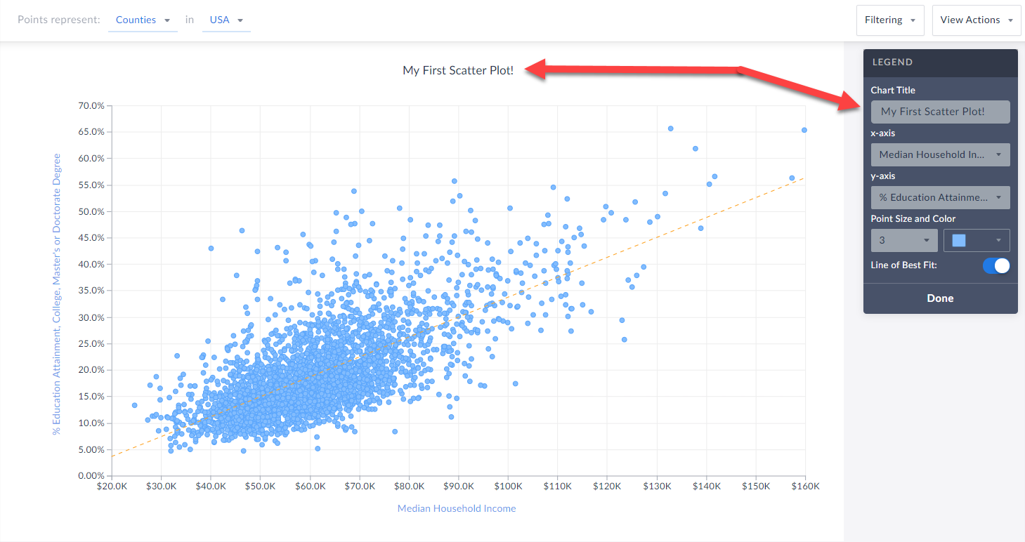
Renaming
You can rename your scatter plot by either clicking on the heading at the top of the graphic, or by selecting Edit on the legend and renaming there.
 Changing Variables
You are welcome to select either axis in the legend, and change the variable(s) you want to analyze.
Changing Point Size and Color
Feel free to edit these options within the Edit Legend page to change the appearance of your graphic.
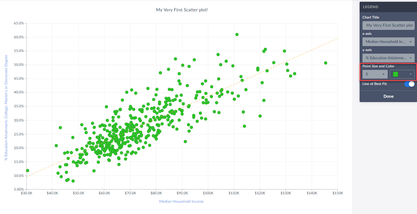
Toggle Off/On the Line of Best Fit
Use this button to toggle between whether or not the line of best fit is present. What is the line of best fit? In short, it is a straight line that best represents the data on a scatter plot.
Advanced
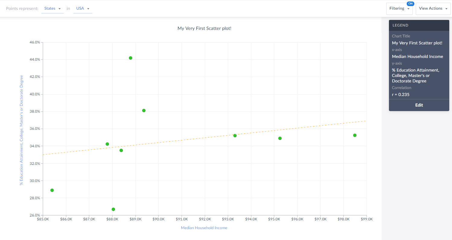
Lastly, you are welcome to create and apply a data filter onto your scatter plot. This will remove any points that do not meet your filter conditions. The image below would normally display all States in the USA, however, there is a median hh income filter applied (inc > $85,000) so you are left with only 9 states (dots) in the chart that meet this criteria.
Also notice how the x-axis has moved to reflect our criteria.
That’s all for today! We’re excited to see some of the interesting scatter plots you can come up with!
Stay safe everyone, and as always, you can access SimplyAnalytics remotely, so please let us know if you are running into any issues with remote access - we are here to help and always available for webinar training sessions.
More from SimplyAnalytics
Posted on Nov 29, 2009 by Admin
The ALA 2010 Midwinter Meeting will be held on January 15-19, 2010 at the Boston Convention and Exhibition Center. (Note that this is not the Hynes Convention Center). Geographic Research...
Posted on Dec 15, 2014 by Admin
Stop by the Geographic Research booth at the Ontario Library Association Super Conference to check out SimplyMap Canada. The conference will take place January 28-31 at the Metro Toronto ...
Posted on Feb 14, 2017 by Admin
In previous blog entries, we highlighted the value of having a mapping application to complement premium data when analyzing America's geographic preferences in credit cards, and mayonnai...
Posted on Mar 18, 2015 by Admin
Can you guess which US city has the most residents per square mile? Today we’re going to use SimplyMap to answer this question for all cities, as well as cities with a population greater ...
Posted on Dec 09, 2014 by Admin
In this week’s SimplyMap blog post, we set out to discover which large US cities spend the most money per year on their pets. To find this out we used the variable, “Pets, Household Avera...
Posted on Apr 30, 2024 by Admin
Congratulations to Brandyn Whitaker as the recipient of the 2024 BRASS Student Travel Award! Brandyn is a Library Services Associate in the Workforce and Economic Development department a...
Posted on Jun 02, 2016 by Admin
Three weeks ago we utilized the SimmonsLOCAL data set to visualize contiguous America’s mayonnaise brand preference. Staying with the American visualization theme, this week’s report will...
Posted on Jun 07, 2011 by Admin
We will be exhibiting at the Special Library Association Annual Conference in Philadelphia and the American Library Association conference in New Orleans later this month. Come and visit ...
Posted on Apr 23, 2018 by Admin
Hello everyone and welcome to this week’s blog. This week we will discuss how to create and utilize filters for your research. Why Use a Filter? Filters are a great way to identify target...
Posted on Jul 09, 2009 by Admin
The American Library Association 2009 Annual Conference will take place in Chicago, IL from July 9- July 15, 2009 at McCormick Place West located at 2301 S. Lake Shore Drive Chicago, IL. ...