


SimplyMap Tip - Editing the Map Legend
Posted on Dec 02, 2014 by Admin
Today we take a look at one of the more advanced features in SimplyMap - editing the map legend. Editing the map legend is a great way to not only customize how the data is distributed on the map, but to also change the look and feel of the map.
First, you can customize the map by changing the geographic unit shown and the variable year from the legend.
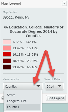
Data can be displayed by State, Congressional District, County, City, ZIP Code, Census Tract, or Census Block Group. The geographic unit can be chosen manually, or you can check the box labeled “Auto-select Geo Unit,” and SimplyMap will automatically display the most appropriate geography based on the zoom level of the map. Zooming into an area will result in increasingly smaller geographic units and present the data in greater detail.
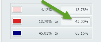
To edit other aspects of the map legend, select “Edit Legend” at the bottom of the legend. The Legend Editor will open. The image below details this dialog, along with an explanation of what can be edited:
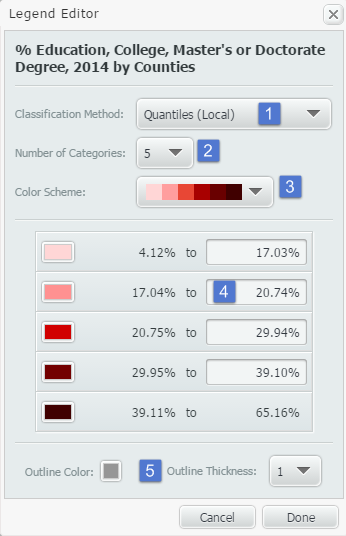
1. Classification Method: This dropdown determines how the data in your map is grouped. There are multiple methods for calculating break values for the data. You can select any of the following from the Classification Method menu:
•Quantiles (Local)
•Quantiles (National)
•Natural Breaks (Local)
•Natural Breaks (National)
•Equal Intervals
Changing from Quantiles (National) to Quantiles (Local) will reconfigure your data ranges to reflect a sample of locations from the current view, as opposed to viewing it on a national scale.
You can learn more about each of the classification methods in the FAQ.
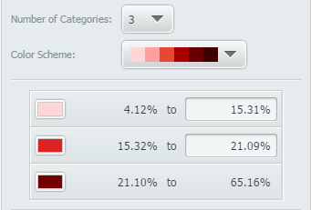
2. Number of Categories: Determines the number of data ranges you would like to see. This will also impact the number of colors you see on the map. By default, this will show 5.
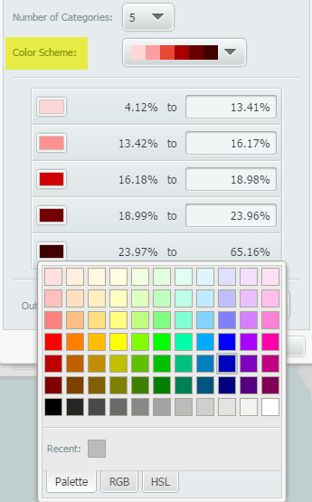
3. Color Scheme: Changes the map’s color scheme. Alternatively, if you select an individual box in the legend, you can apply your color of choice for each.
4. Data Values: Allows the user to manually enter new category break values and create custom data ranges.
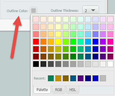
5. Outline Color/Outline Thickness: Changes the color and thickness of your map’s outline. The image below shows a map’s color outline and thickness set to a darker grey, and 2 respectively.
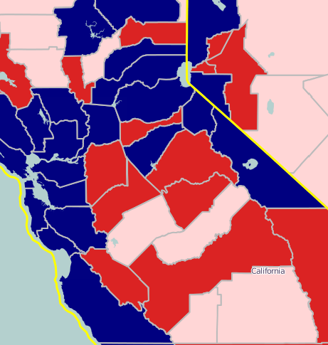
This is what the final map would look like with the edited color outline and thickness:
Stay tuned for more SimplyMap tips and tricks!
More from SimplyAnalytics
Posted on Mar 02, 2018 by Admin
In this week’s blog we’ll take a look at how to enter an address in SimplyAnalytics to find the Census Block Group or Census Tract. Let’s get started! Use Case: You want to analyze the ar...
Posted on Oct 07, 2024 by Admin
We're headed to Charleston! Come visit the SimplyAnalytics team on November 12th at the Gaillard Center at booth 41. We'll be doing live demonstrations of the database, answering question...
Posted on Nov 29, 2009 by Admin
The ALA 2010 Midwinter Meeting will be held on January 15-19, 2010 at the Boston Convention and Exhibition Center. (Note that this is not the Hynes Convention Center). Geographic Research...
Posted on May 19, 2016 by Admin
Drop by booth #215 at the SLA 2016 conference to chat with us and get the latest info on SimplyMap. We look forward to seeing our customers, friends, and all others interested in learning...
Posted on Jul 20, 2020 by Admin
Hello readers! We hope you are doing well and staying safe. Today we are excited to introduce the Simmons NCS crosstabs functionality! This is a feature we’ve been working on for a while,...
Posted on Jul 30, 2015 by Admin
One great feature within SimplyMap is the ability to track the same variable across multiple years. In this report, we will track the percentage of households in the US ordering items fro...
Posted on Dec 15, 2014 by Admin
Stop by the Geographic Research booth at the Ontario Library Association Super Conference to check out SimplyMap Canada. The conference will take place January 28-31 at the Metro Toronto ...
Posted on Apr 18, 2017 by Admin
We look forward to attending the Texas Library Association Conference this week in San Antonio and visiting with the library community. Stop by our new SimplyAnalytics booth (2029) and ta...
Posted on Dec 30, 2009 by Admin
Skokie Public Library, in Skokie, IL has published a useful overview of SimplyMap on the Mike's Space blog on SkokieNet. The article is filled with examples of research questions that can...
Posted on Dec 02, 2014 by Admin
Today we take a look at one of the more advanced features in SimplyMap - editing the map legend. Editing the map legend is a great way to not only customize how the data is distributed on...