 Go up
Go up


Quick Tips: Mapping
Posted on Mar 22, 2016 by Admin
Inspired by some recent support desk questions, this week’s SimplyMap report will provide some useful tips and tricks to help make the most out of your maps. Let’s get started!
First, let’s take a look at the map that we will apply changes to. This is a map showing Median Household Income for the city of Chicago:
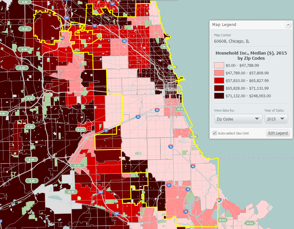
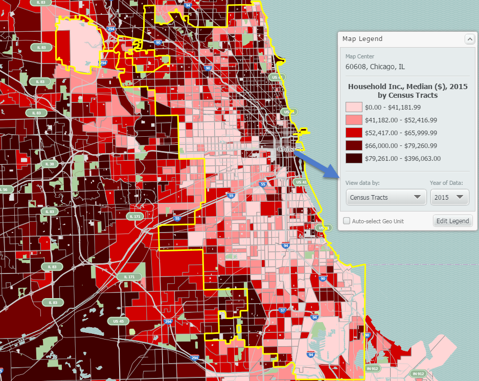
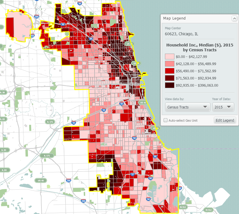
At this level of zoom and geography, your map will display by ZIP Codes. If you’d like to see a more granular map, select a smaller geography from the View Data By dropdown in your map legend. The map below displays the data by census tract:
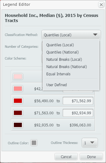
Next, when you create maps in SimplyMap, by default the legend values will use national figures. If you would like to see your map legend changed to reflect the underlying data specifically for the region shown on the map, try changing the classification method to be Quantiles Local. This option is found in the Edit Legend menu.
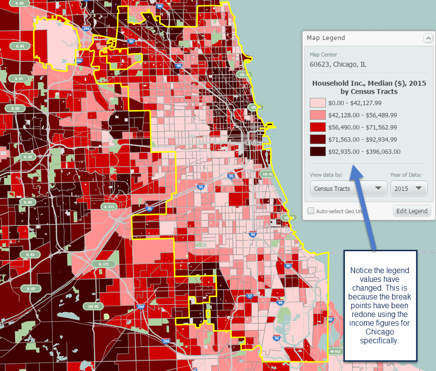
New map shown below with reconfigured break points:
The last tip we have here involves applying a location mask to your map. Doing so will remove the surrounding areas around your selected location. This feature is found in the Display Options dropdown located towards the top right of SimplyMap.
Final map shown below:
Our tips summarized:
1. Try changing the unit of geography for your map to be smaller from the View Data By dropdown in the legend.
2. Change the classification method of your map to be quantiles local. This reconfigures your break points to reflect the underlying data of your study area (we used Chicago).
3. Apply a Location Mask from the Display Options menu.
We hope you enjoyed these tips - stay tuned for more!
More from SimplyAnalytics


Posted on Apr 28, 2016 by Admin
In this week’s SimplyMap report we’ll take a look at one of our newer data packages offered, P$YCLE® by Nielsen. P$YCLE® is a segmentation system that evaluates consumers using key demogr...
Posted on Apr 30, 2024 by Admin
Congratulations to Brandyn Whitaker as the recipient of the 2024 BRASS Student Travel Award! Brandyn is a Library Services Associate in the Workforce and Economic Development department a...
Posted on Jan 08, 2018 by Admin
The SimplyAnalytics team will be exhibiting at ALA Midwinter in Denver February 9-12. Stop by booth 2152 for a visit and a tour of SimplyAnalytics, the best-in-class analytics and data vi...
Posted on Mar 11, 2024 by Admin
We're thrilled to announce that SimplyAnalytics will be exhibiting at the ALA Annual Conference in San Diego! We can't wait to connect with library professionals, share insights, and show...
Posted on Oct 07, 2024 by Admin
We're headed to Charleston! Come visit the SimplyAnalytics team on November 12th at the Gaillard Center at booth 41. We'll be doing live demonstrations of the database, answering question...
Posted on Sep 28, 2018 by Admin
Welcome readers! Today we have a quick feature highlight that will assist you in browsing and searching for data variables. All data variables have a path where they reside within their d...
Posted on May 17, 2012 by Admin
We will be exhibiting at the American Library Association (ALA) Conference in Anaheim Friday June 22nd - Monday June 25th. Visit us at Booth 421 to learn more about SimplyMap and enter ou...
Posted on Nov 23, 2012 by Admin
Men's Health magazine is charting vanity in US cities, with help from SimplyMap. What did they find? The Sunshine State, with a long history of going to great lengths to look good, tops t...
Posted on May 10, 2016 by Admin
One benefit of data and applications like SimplyMap is the ability to visualize information. In this week’s report, we’ll take a quick look at some branding preferences in contiguous Amer...
Posted on Nov 17, 2014 by Admin
Our recent series Exploring SimplyMap Data Reports has focused on creating ranking reports for unique variables. Accordingly, we thought it would be helpful to write a quick tip on how to...