


Introducing Histograms to SimplyAnalytics
Posted on Sep 14, 2021 by Admin
Welcome readers! Today we are excited to welcome histograms to SimplyAnalytics. We hope you enjoy this wonderful new visualization as much as we do. Let’s take a look.
What is a histogram?
In short, a histogram is similar to a bar chart, but instead groups values into ranges (referred to as “bins”). The height of each bar displays how many values fall within that bin.
Example
Let’s take a look at an easy to read example. The histogram view can be found under New View > Histogram in the program. The example below is showing the % of adults (pop 25+) with a bachelor’s degree or higher in States in the USA.
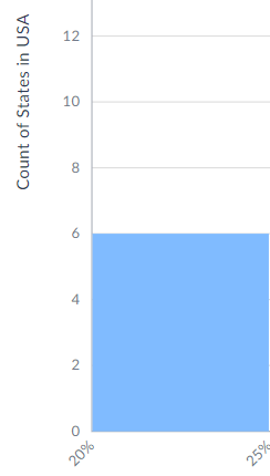
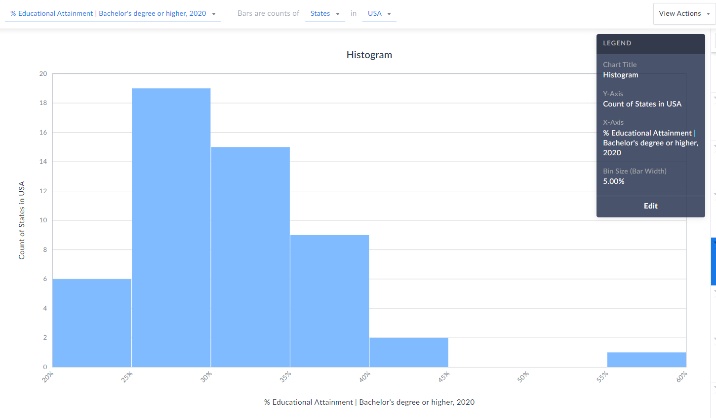 Each bin size, or bar width along the X axis represents a 5% range - so, 20-25%, 25-30%, etc. (zoomed in below)
 The height of each bin represents how many states fall within that bin/range. The example here means that 6 states in the USA have between 20-25% of the adult population who have a bachelor’s degree or higher.
 TIP: Reference the legend on your screen to help interpret the visualization.
Notice towards the far-right of our histogram there does seem to be a potential outlier in the data - there is 1 state where 55-60% of the population 25 and above have at least a bachelor’s degree! Can you guess what state that is?
Answer/Bonus Tip: Towards the top-right of your histogram, click on View Actions > Create Data Table.
TIP: Reference the legend on your screen to help interpret the visualization.
Notice towards the far-right of our histogram there does seem to be a potential outlier in the data - there is 1 state where 55-60% of the population 25 and above have at least a bachelor’s degree! Can you guess what state that is?
Answer/Bonus Tip: Towards the top-right of your histogram, click on View Actions > Create Data Table.
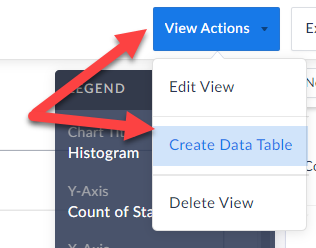 This will generate a Ranking Report for you, and you can quickly sort to find out the answer here…...drum roll…...it’s the District of Columbia, with a value of 57.15% - the lone state within that bin mentioned above.
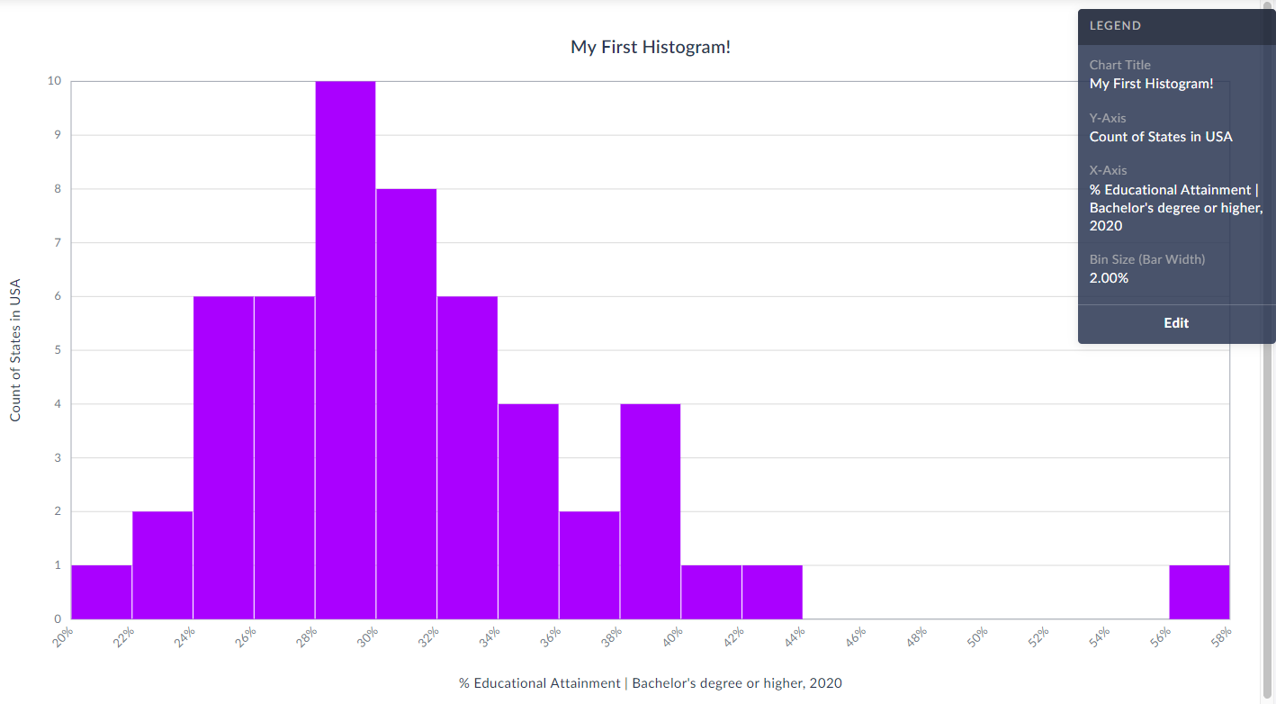
Last Note: You can edit the color of the bars, title and bin sizes of your histogram by clicking Edit on the Legend.
This will generate a Ranking Report for you, and you can quickly sort to find out the answer here…...drum roll…...it’s the District of Columbia, with a value of 57.15% - the lone state within that bin mentioned above.
Last Note: You can edit the color of the bars, title and bin sizes of your histogram by clicking Edit on the Legend. 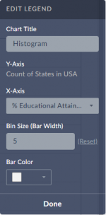 Feel free to make any changes here, and your histogram will automatically be updated.
Check out our final histogram below with new colored bins, bin sizes set to 2% instead of 5%, and title.
As always, you are welcome to export your work by clicking on the Export button towards the top-right of the screen.
Feel free to make any changes here, and your histogram will automatically be updated.
Check out our final histogram below with new colored bins, bin sizes set to 2% instead of 5%, and title.
As always, you are welcome to export your work by clicking on the Export button towards the top-right of the screen.
 We hope you enjoy this new visualization! Feel free to contact us at anytime by emailing support@simplyanalytics.com
Each bin size, or bar width along the X axis represents a 5% range - so, 20-25%, 25-30%, etc. (zoomed in below)
 The height of each bin represents how many states fall within that bin/range. The example here means that 6 states in the USA have between 20-25% of the adult population who have a bachelor’s degree or higher.
TIP: Reference the legend on your screen to help interpret the visualization.
Notice towards the far-right of our histogram there does seem to be a potential outlier in the data - there is 1 state where 55-60% of the population 25 and above have at least a bachelor’s degree! Can you guess what state that is?
Answer/Bonus Tip: Towards the top-right of your histogram, click on View Actions > Create Data Table.
This will generate a Ranking Report for you, and you can quickly sort to find out the answer here…...drum roll…...it’s the District of Columbia, with a value of 57.15% - the lone state within that bin mentioned above.
Last Note: You can edit the color of the bars, title and bin sizes of your histogram by clicking Edit on the Legend. Feel free to make any changes here, and your histogram will automatically be updated.
Check out our final histogram below with new colored bins, bin sizes set to 2% instead of 5%, and title.
As always, you are welcome to export your work by clicking on the Export button towards the top-right of the screen.
We hope you enjoy this new visualization! Feel free to contact us at anytime by emailing support@simplyanalytics.com
The height of each bin represents how many states fall within that bin/range. The example here means that 6 states in the USA have between 20-25% of the adult population who have a bachelor’s degree or higher.
TIP: Reference the legend on your screen to help interpret the visualization.
Notice towards the far-right of our histogram there does seem to be a potential outlier in the data - there is 1 state where 55-60% of the population 25 and above have at least a bachelor’s degree! Can you guess what state that is?
Answer/Bonus Tip: Towards the top-right of your histogram, click on View Actions > Create Data Table.
This will generate a Ranking Report for you, and you can quickly sort to find out the answer here…...drum roll…...it’s the District of Columbia, with a value of 57.15% - the lone state within that bin mentioned above.
Last Note: You can edit the color of the bars, title and bin sizes of your histogram by clicking Edit on the Legend. Feel free to make any changes here, and your histogram will automatically be updated.
Check out our final histogram below with new colored bins, bin sizes set to 2% instead of 5%, and title.
As always, you are welcome to export your work by clicking on the Export button towards the top-right of the screen.
We hope you enjoy this new visualization! Feel free to contact us at anytime by emailing support@simplyanalytics.com
More from SimplyAnalytics
Posted on Feb 01, 2009 by Admin
Want to know the top 10 wealthiest ZIP codes in your state? How about the top 25 counties with the most elderly residents? Duke University students can now easily answer these questions a...
Posted on Feb 25, 2020 by Admin
SimplyAnalytics will be exhibiting at the PLA Conference, held this year at the Music City Center in Nashville, TN on February 26 - 28. Visit the team at Booth 1444 with your questions, f...
Posted on Nov 28, 2012 by Admin
Come visit the SimplyMap team at the ALA Midwinter Meeting, January 25 - 28, 2013 in Seattle, WA. We will be in Booth 1307, and as always we look forward to meeting with customers new and...
Posted on Dec 15, 2014 by Admin
Stop by the Geographic Research booth at the Ontario Library Association Super Conference to check out SimplyMap Canada. The conference will take place January 28-31 at the Metro Toronto ...
Posted on Nov 23, 2012 by Admin
Men's Health magazine is charting vanity in US cities, with help from SimplyMap. What did they find? The Sunshine State, with a long history of going to great lengths to look good, tops t...
Posted on May 03, 2011 by Admin
The GRI team is very excited to announce the launch of SimplyMap 2.0! Completely redesigned, it is now easier than ever to access data and create professional quality thematic maps and re...
Posted on Dec 03, 2012 by Admin
Come visit the Geographic Research booth at the Ontario Library Association Super Conference this season. The conference will take place on January 30 - February 2, 2013 at the Metro Toro...
Posted on Feb 19, 2016 by Admin
Drop by booth #857 at PLA 2016 to meet the SimplyMap team and learn more about the features and functions behind SimplyMap. Have a Ghirardelli Chocolate while we present SimplyMap and off...
Posted on Jun 25, 2015 by Admin
In this week’s SimplyMap report, we review the different options available when searching for a business. The easiest and fastest method of mapping businesses or creating a business repor...
Posted on Jun 21, 2022 by Admin
Hello readers! We hope you’re having a great day. Today we are featuring 5 commonly asked questions about the American Community Survey dataset that’s available to all customers in Simply...