


A COVID-19 Analysis with SimplyAnalytics
Posted on Apr 30, 2020 by Admin
We find ourselves in the middle of an unprecedented crisis the likes of which most of us have never experienced before, and hopefully won’t have to experience again. There is the occasional moment that makes us smile in the middle of it all (like when people are buying up all the fluffy yellow baby chicks out there – but please, don’t cuddle your feathered friends), but overall the situation is scary and it’s probably safe to say all of us are feeling anxious about the near and distant future alike. The reason we’re so concerned is not just because of the scale of this outbreak and the impact it’s having on individual people, society, and the economy, but also due to uncertainty and confusion. We don’t yet know much about this novel virus, and that’s why everyone is trying to collect and share as much information as possible. To that end, we want to provide some insight into the spread and severity of the Coronavirus using health and demographic data.
Aside from actual virus spread data, we can look at various factors that might indicate elevated risk of developing severe illness if and when the virus spreads in an area, i.e. who will need extra help recovering from COVID-19, the lung disease caused by the Coronavirus. These risk factors are most reliably described by national and international health organizations such as the CDC, the WHO, and the ECDC. And although these sources do emphasize that we don’t yet know for sure what sort of factors actually affect our susceptibility to the virus and severe progressions (for example, we do see young, healthy people becoming very ill), they provide what amounts to their current best estimate.
Thus far, there is a consensus that older people (65 years and above), people who smoke, and people who suffer from hypertension (high blood pressure) are most at risk of developing severe illness. Many of these sources also speculate that various serious underlying, often chronic medical conditions further increase the risk. Such conditions include for example Coronary and cardiovascular (heart) diseases, respiratory (lung) diseases, and diabetes. More recently, we’ve discovered that we can add obesity to the list of risk factors. It is clear that experts are still figuring out what conditions and behaviors constitute risk factors for developing sever illness, to what extent each factor affects the progression of the illness, and how factors interact with each other.
So to start off our risk analysis we’ll look at a SimplyAnalytics map of the USA, where we can easily filter on smoking, hypertension, and age. We’ll gray out those counties that report percentages rate above national rates for all of these three risk factors, and then we’ll color code the remaining counties by population density. At the national level, 16% of the population is over 65 years old, 17.5% of the population smoke, and 18% of the population has high blood pressure (this data is available in the SimplyAnalytics app, provided by Experian Simmons and EASI). We already know from past experience and observing places such as New York City that high population density increases the spread rate of viruses. We also already know that big parties and events, such as the New Orleans’ carnival, help the virus spread.
So, for our map, we’ll use three colors to code population density: the lightest color shows below national density, the slightly darker color shows about the same density as nationally (which is 93 people per square mile, according to data from EASI), and the third color (dark red) represents above national population density. Alaska, Hawaii, and other landmass outliers are not pictured but are certainly available to explore in our app. We see a very interesting visual representation of areas whose population has a high risk of developing severe illness if infected, and we’ll dive in deeper right after a brief tangent of looking at one more map.
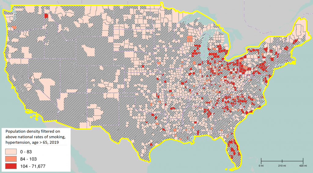 Image 1: SimplyAnalytics download of county map showing population density filtered by above national rates in all of: smoking, population over 65, and hypertension, 2019
This next map is basically the same as the above but filtered on any instead of all of the three risk factors smoking, hypertension, and age (using “or” in our filter instead of “and”). The second map barely has any areas grayed out, which means that essentially the whole country is above the national rate for at least one of those risk factors – which means a whole lot of people have at least a somewhat elevated risk of developing severe illness when infected. And that means that every one of us, no matter where we live or how young or healthy we are, should be taking precautions such as social distancing and practicing exceptionally good hygiene.
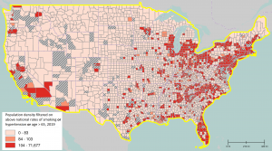
Image 2: SimplyAnalytics download of county map showing population density filtered by above national rates in any of: smoking, population over 65, and hypertension, 2019
To find high risk cities and ZIP codes, we use SimplyAnalytics’ ranking view paired with our app’s filtering feature. For example, about 3,000 cities have a population density and population proportions of the risk factors smoking, hypertension, and population over 65 that are higher than those of the nation as a whole. Out of those, 21 cities have a population of more than 100,000, and the following 8 cities have a population of more than 190,000.
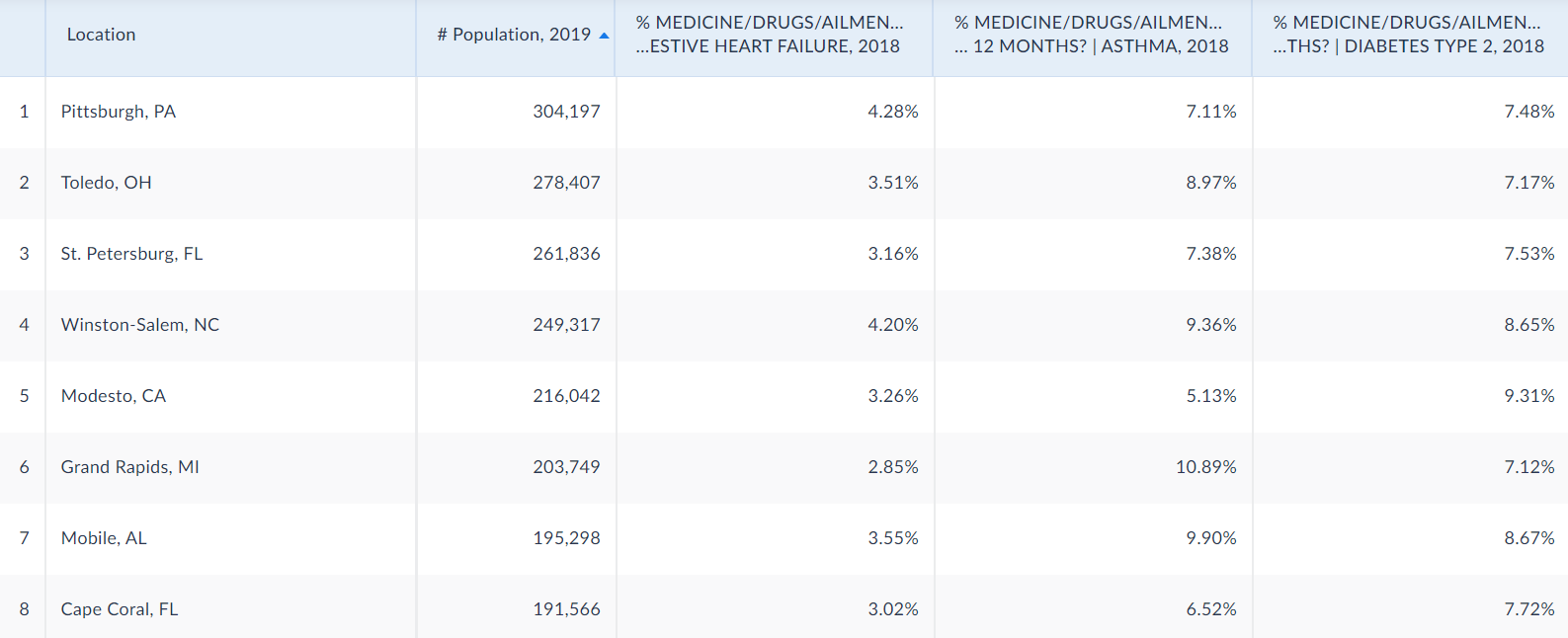
Image 3: SimplyAnalytics screenshot of ranking view showing the most populous cities with above national rates of smoking, hypertension, population over 65, population density, and >190,000 population, 2019
Those three additional columns show the prevalence of heart disease/congestive heart failure (nationally 2.9%), the most common respiratory disease, asthma (nationally 7%), and the most common type of diabetes, type 2 (nationally 7.7%). Based on that, we can see that 6 of these large cities also fall above the national percentage rates for at least two additional risk measures. If you live in any of these cities, we can only appeal to you to be extremely diligent in following guidelines and recommendations to help slow down the spread of the Coronavirus.
To identify some smaller, particularly high risk towns, let’s look at places whose rates of smoking, hypertension, population density, and population above 65 are bigger than two times the national rate. That leaves 24 towns in total, 21 of which have a population over 1,000 and the following 4 have a population over 3,000. Those are relatively small places, of course, but they also report extremely high numbers for all three primary risk factors, and additionally very high prevalence of the three further potential risk indicators.
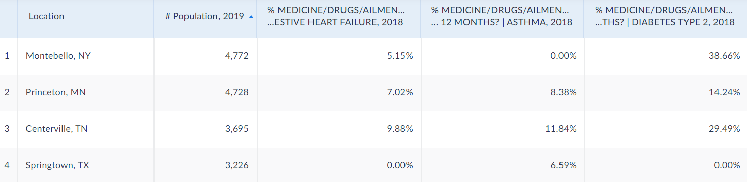
Image 4: SimplyAnalytics screenshot of ranking view showing the most populous cities with above 2x national rates of smoking, hypertension, population over 65, population density, and >3,000 population, 2019
We’ll take a quick look at high risk ZIP codes, too. Going back to our ranking view of cities filtered by above national rate of smoking, hypertension, population density, and population over 65, we just change the SimplyAnalytics granularity drop down to ZIP codes. Of the 2367 ZIP codes returned by the ranking view, with the filters still applied, we see that the biggest population (over 85,000) can be found in a ZIP code of the city Hesperia, CA in San Bernardino county.

Image 5: SimplyAnalytics screenshot of ranking view showing the most populous zip code with above national rates of smoking, hypertension, population over 65, and population density, 2019
To get a little more info about that area, we’ll do a ring study. SimplyAnalytics ring studies include a 1, 3, and 5-mile radius around the center of the selected geographic unit – that Hesperia ZIP code in our case – as well as a comparison column with values for the entire USA. It’s interesting that the percentages of population above 65 and of smokers is highest in the center and shrinks with bigger radii (still mostly above the national rates), but the prevalence of hypertension is actually smallest in the center and increases with distance. Clearly, the demographics of urban and nearby suburban areas are complex, and impacted by a number of factors. This makes it difficult to draw specific conclusions about how exactly the Coronavirus might affect this area. Still, this information supports our hypothesis that Hesperia, CA may be at a uniquely high risk of many citizens developing severe illness if there is an outbreak in the area.
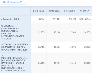
Image 6: SimplyAnalytics screenshot of ring study showing the most populous zip code with above national rates of smoking, hypertension, population over 65, and population density, 2019
Now that we have some information on high risk areas and where they are, we can look at data about the current ongoing spread of the Coronavirus. Recently, we introduced a new dataset to SimplyAnalytics that includes daily updates of Coronavirus cases and deaths. The data is sourced from USAFact's county-level dataset. We’ll combine these new data variables with our risk factor variables and, via the ranking view, download that data for all counties. Then we’ll run some analyses in Jupyter (an online app that we’re using to write and share Python code) to create new data variables that we can import into the SimplyAnalytics app to create visualizations.
One very important thing to remember is that a high risk of developing severe illness has nothing to do with spreading the virus. We can see that very clearly in the following scatter plot (a new feature in our app), which uses a filter to show counties with high numbers of confirmed Coronavirus infections at the end of this month (April 2020) plotted against a severe illness risk score. This score ranges from 0 to 1, and the higher the risk score, the more likely it is that more people will experience severe illness in the course of a Coronavirus infection. Hovering over/clicking on a dot in the plot reveals the associated location name as well as X and Y values. For reference, the image directly after the scatter plot is a ranking view of the same data including location names, sorted by risk score in descending order.
- Methodology note: we computed each county’s risk score by adding up z-scores of the basic risk factors smoking, hypertension, and population over 65 (each z-score basically indicates how far off from the average across all counties each county is) and then normalizing the results to get a value between 0 and 1. We also calculated the cases per square mile variable by multiplying confirmed cases per 100,000 by population density and then dividing by 100,000.
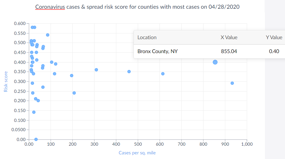
Image 7: SimplyAnalytics scatter plot of imported confirmed Coronavirus cases per sq. mile and severe illness risk score data, 04/28/2020
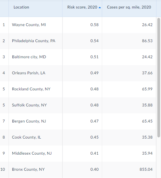
Image 8: SimplyAnalytics ranking view of imported confirmed Coronavirus cases per sq. mile and severe illness risk score data sorted by risk score in descending order, 04/028/2020
Next, we look at a Coronavirus spread likelihood score, which we calculated much the same way: adding up z-scores for population density, population size, and how many people had the flu in the last 12 months, and then normalizing those values. We import this calculated data into the app and produce the below scatterplot with best fit line. Not surprisingly, that spread score and the actual spread of confirmed Coronavirus cases appears to be correlated, with outliers only at the low end of case prevalence. So, at the risk of sounding like a broken record, please stay safe and wash your hands thoroughly – especially if you’re living in densely populated cities.
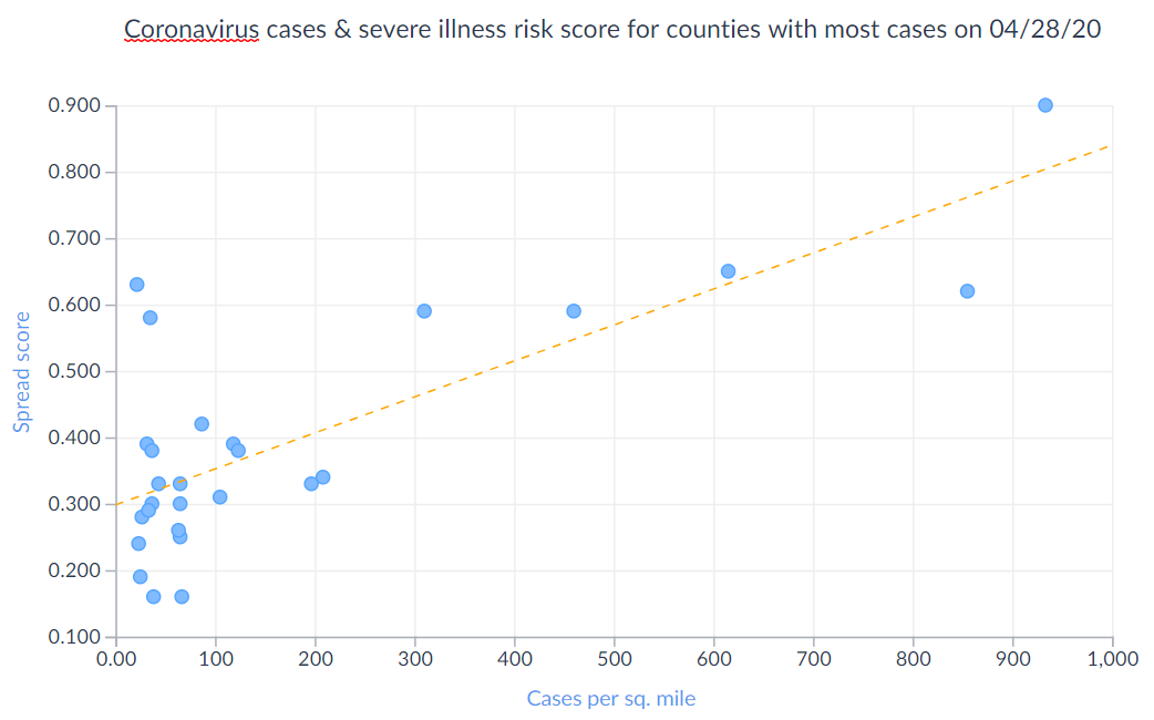
Image 9: SimplyAnalytics scatter plot of imported confirmed Coronavirus cases per sq. mile and spread risk score data, 04/28/2020
We also looked at a graph plotting our risk score against fatalities, but at this point thankfully the occurrence of the latter is too low to yield meaningful results. So we’ll move right along to look at daily new infection counts for a few counties that have the highest infection rates overall so far. First, we examine a ranking view of the newest data on prevalence of confirmed infections to identify counties with highest infection rates. Then we create three bar charts for the prevalence of confirmed infections variable (one for March 17th, an early date with low infection rates, one three weeks later for April 7th, a half-way point with rising infection rates, and the last one another three weeks later for April 28th, current infection rates) and select the top 10 counties identified via the ranking view, plus the USA, as our geographic units to include in the charts.
We can see that Westchester County, NY had the highest infection rate early on, but was overtaken by Blaine County, ID, which shot up from 0 infections to the highest infection rate well within three weeks, as well as Rockland County, NY, which moved from the middle of the field up to the highest infection rate and past Blaine County, ID within six weeks. From this we can deduce that Blaine County, ID has a particularly steep infection curve, but it is important to note that it’s also the smallest county with a population just shy of 30,000. All other counties have populations well over 300,000 and some even over 1 million. For our last bar chart comparisons, we’ll calculate and explore the number of new cases per day.
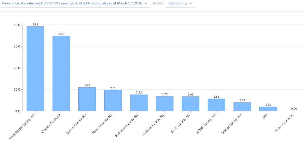
Image 10: SimplyAnalytics bar chart of cumulative confirmed Coronavirus cases per 100,000 in (to date) most affected counties on 03/17/2020
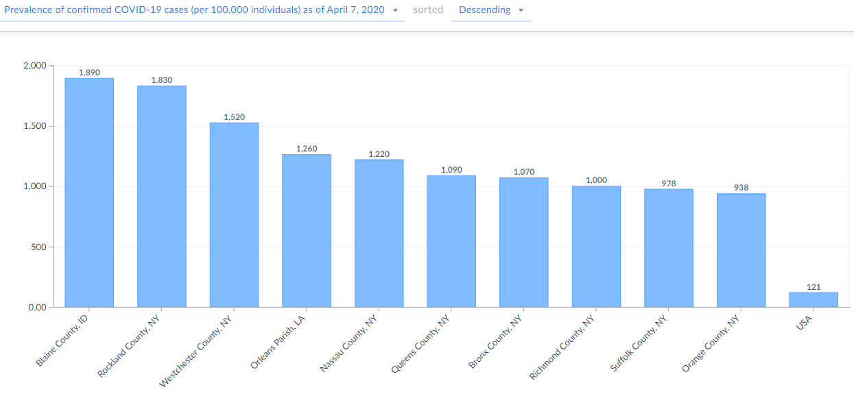
Image 11: SimplyAnalytics bar chart of cumulative confirmed Coronavirus cases per 100,000 in (to date) most affected counties on 04/07/2020
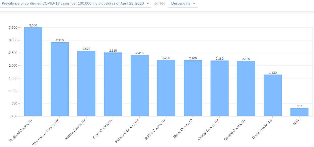
Image 12: SimplyAnalytics bar chart of cumulative confirmed Coronavirus cases per 100,000 in (to date) most affected counties on 04/28/2020
Since Blaine County, ID is such an outlier, we'll drop it from these next charts to reduce noise so that the case development of other counties is more clearly visible. The charts show counties with the highest rates of daily new cases compared to the rest of the country so far – again for the days of March 17th, April 7th, and April 28th. Comparing these three bar charts, we still see a lot of noise, for example Bronx County, NY moves from the middle of the field up to highest number of new cases in a day compared to other counties, and Westchester County, NY experienced a significant reduction of daily new cases over the last six weeks.
This data most likely demonstrates infection rate peaks; but, a word of caution: we do have to remember that some apparent peaks may be influenced by noise related to varying extents of testing and reporting. As we get more data, overall trends will become clearer and will help us predict Coronavirus spread development curves of future infection waves and in other counties that are similar in terms of their population as well as local government recommendations. Such similarities can also be explored using SimplyAnalytics and the data available in our app.
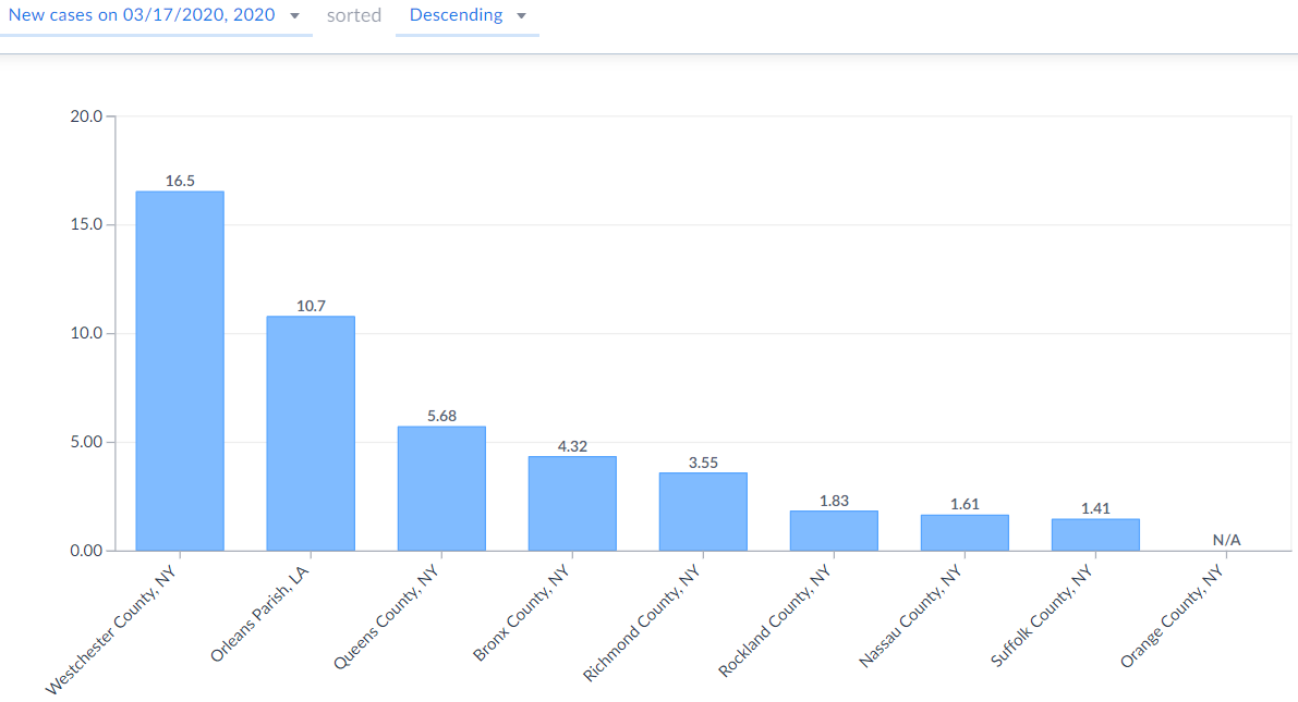
Image 13: SimplyAnalytics bar chart of new confirmed Coronavirus cases per 100,000 on 03/17/20 in (to date) most affected counties
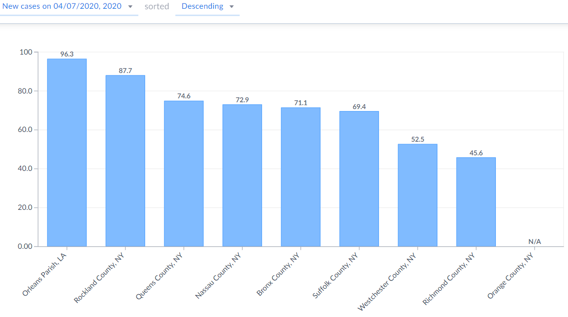
Image 14: SimplyAnalytics bar chart of new confirmed Coronavirus cases per 100,000 on 04/07/20 in (to date) most affected counties
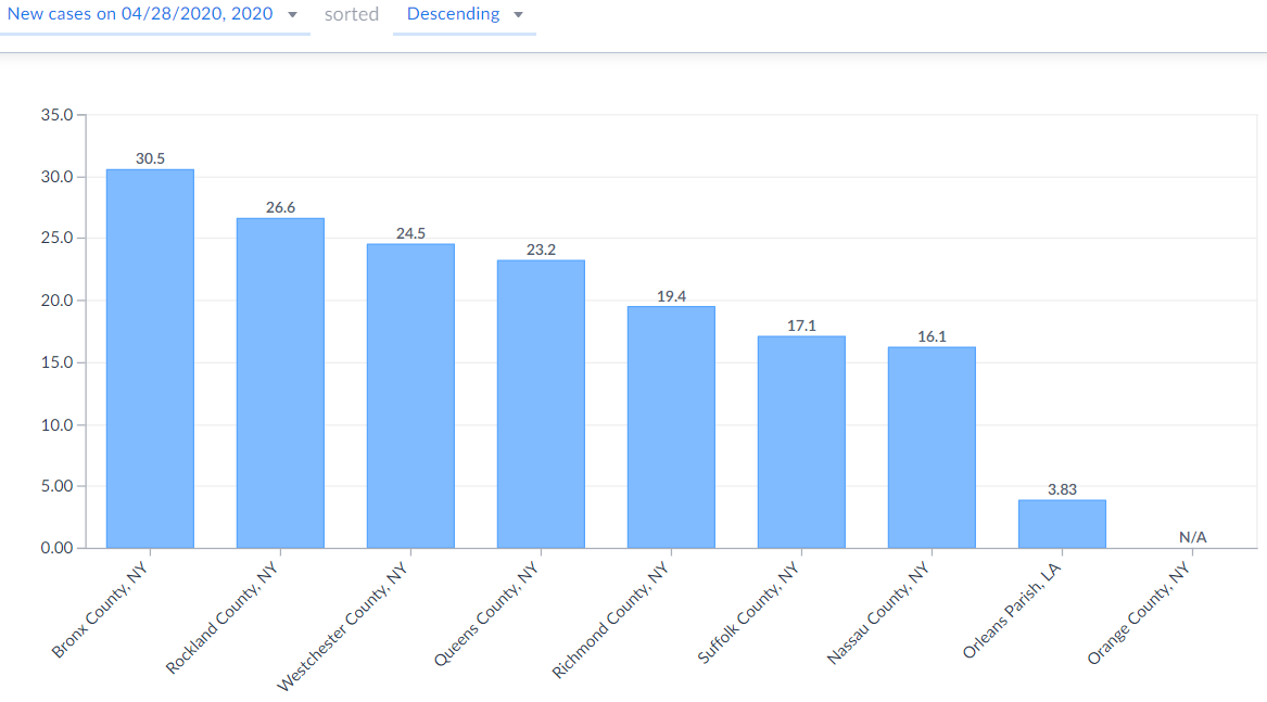
Image 15: SimplyAnalytics bar chart of new confirmed Coronavirus cases per 100,000 on 04/28/20 in (to date) most affected counties
This capability to learn from infection spread curves of similar places, paired with the ability to detect high risk areas – especially as risk factors related to severe illness are more definitively identified – could help us customize our response to the spread of the Coronavirus and cases of COVID-19, and might assist with determining and organizing redistribution of our resources to wherever they are needed the most at any given time.
We are committed to providing remote access and high quality customer support to all of our users who are now working remotely. Please contact us at support@simplyanalytics.com if you have any questions.
More from SimplyAnalytics
Posted on Dec 02, 2019 by Admin
Hi everybody! We’re back this week with another question from our Help Desk. This time featuring SimplyAnalytics Canada. Let’s get started! Question: How can I analyze all of the PRIZM5 s...
Posted on Dec 07, 2011 by Admin
We will be exhibiting at the American Library Association Midwinter Meeting & Exhibition in Dallas this January. Visit us at booth 2513 for a demonstration and to have all your Simply...
Posted on Jul 28, 2013 by Admin
We recently discovered some interesting data on participation and attitudes towards recycling, and decided to dig a bit deeper into our Experian SimmonsLOCAL data. This data package inclu...
Posted on Oct 24, 2014 by Admin
At times it can be useful to apply filters to the data in SimplyMap as a means of focusing on specific characteristics, or preforming a query. For example, a map showing household income ...
Posted on Oct 16, 2015 by Admin
Did you know that SimplyMap includes the ability to export Shapefile data for use in desktop mapping software (such as MapInfo or ArcGIS)? This advanced feature extends the power of Simpl...
Posted on Jun 16, 2016 by Admin
This week’s SimplyMap report is a quick tip that we hope you find useful and time saving. Did you know that SimplyMap will save all recently searched business queries for future usage? Le...
Posted on Dec 16, 2015 by Admin
Visit the SimplyMap team at the ALA Midwinter Meeting 2016 in Boston. We will be at booth #1913 offering product demonstrations, tips & tricks, and of course Ghirardelli Chocolate! Ex...
Posted on Aug 26, 2015 by Admin
Most people in the United States could probably guess which cities are popular amongst tourists - Los Angeles and New York. But can you guess how much money is spent in novelty and souven...
Posted on Feb 21, 2018 by Admin
We are looking forward to sharing SimplyAnalytics with the public library community at the upcoming PLA 2018 Conference in Philadelphia, PA. Our team will be exhibiting in Booth #855. Vis...
Posted on Sep 27, 2019 by Admin
Hello readers! This week we provide an in-depth response to a question asking about the legend classification methods in SimplyAnalytics. This response is now part of our Help Center: htt...