


Introducing Simmons NCS Crosstabs
Posted on Jul 20, 2020 by Admin
Hello readers! We hope you are doing well and staying safe. Today we are excited to introduce the Simmons NCS crosstabs functionality! This is a feature we’ve been working on for a while, and we know many of you out there have requested it. The wait is officially over, and this data/feature is now available for trial or purchase right now. Let’s dig into it.
What is a crosstab?
A crosstab is a table showing the relationship between two or more data variables. This is extremely useful in identifying correlations, patterns or trends when working with large datasets.
What exactly does that mean?
This means you can instantly look up to see if there is any relationship between age groups and social media patterns. Or trends between income and the types of sports people watch on TV, or the types of vehicles owned relative to exercise habits. Because we use the Simmons NCS data, there are literally tens of thousands of demographic and consumer behavior variables you can research!
Why should I be excited?
Traditionally, doing this type of analysis is tedious and requires users to be well versed in advanced data analytics platforms that require a lot of time and effort to learn. In SimplyAnalytics, however, we’ve developed this feature to enable all users to run crosstabs in a few mouse clicks!
Show me!
In SimplyAnalytics, click on New View > Create under the crosstabs report. This opens the Edit View screen. By default, the USA will be selected as the location since Simmons NCS data is only available at the national level.
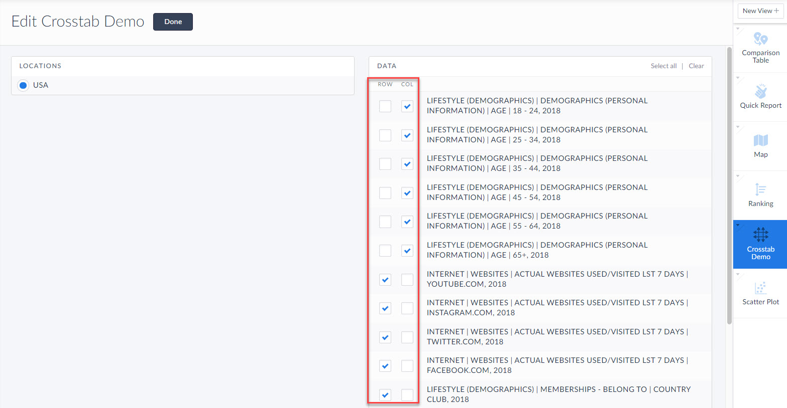
From here, add some data variables you want to analyze. SimplyAnalytics will automatically add demographic variables as columns to easier make sense of the data. Click done, and voila you’re done! The crosstab generates.
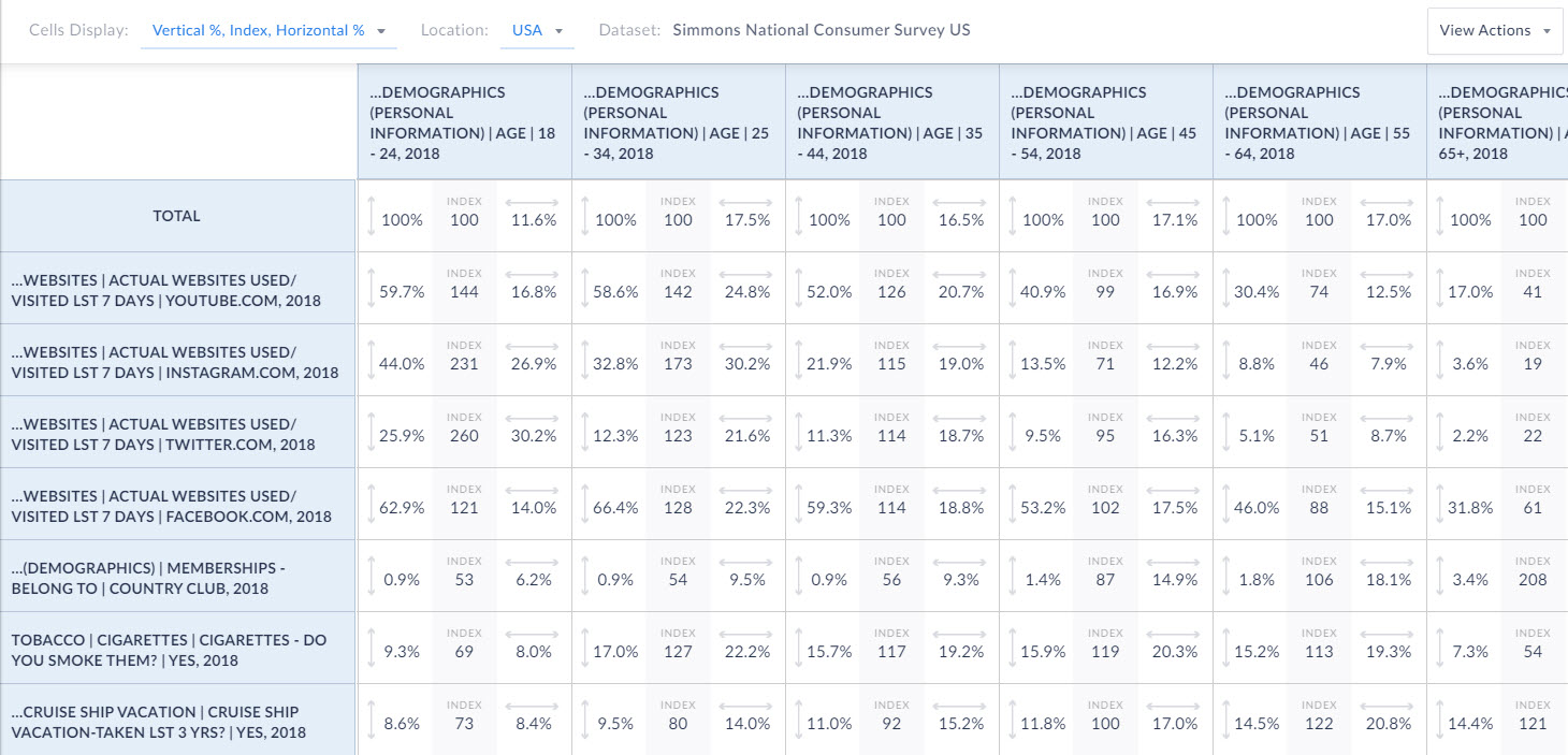
Interpreting the 3 values in the boxes
Each of the boxes in the crosstab report has 3 different values. Let’s discuss those now.
Index - Displays the likelihood versus the total population, of meeting both the Column and Row specifications. The base level is 100. So anything over 100 is more likely and any value less than 100 is less likely. You can read these as percentages as well. This is a great way to quickly scan the data. For example, looking at our data, the index value for using Twitter is off the charts for the 18-24 age group at 260! Compare this with the 65+ age group which is only an index of 22.
Vertical Percent - Looks like this:  The percentage of people who have a given characteristic as defined by the Column heading.
Horizontal Percent - Looks like this:  The percentage of people who have a given characteristic as defined by the Row heading.
Let’s take a look at how to interpret the percentages below.
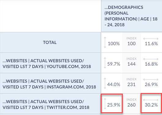
The vertical percent is 25.9%. This means that of people aged 18-24, 25.9% have used Twitter in the past 7 days.
The horizontal percent is 30.2%. This means that 30.2% of users who have visited Twitter in the past 7 days are aged 18-24.
If you’d like to take a look at additional metadata, you can select the dropdown at the top of the report to instead display: Sample, Weighted, and Total %.
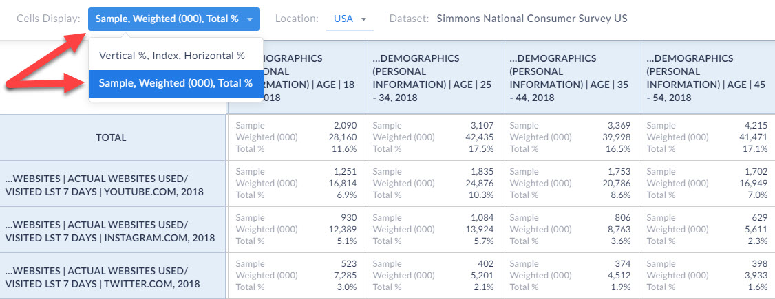
Let’s define those values, and then look at an example again.
Sample - the actual number of respondents to the Simmons NCS survey who meet the specifications of both the Row and the Column.
Weighted - a projection the total number of adults in the U.S. population who meet the specifications of both the Row and the Column. Add three zeros (000) to the end of the number to get the total value.
Total % - The crosstab count divided by the total population in the USA.
Let’s take a look at how to interpret this below:
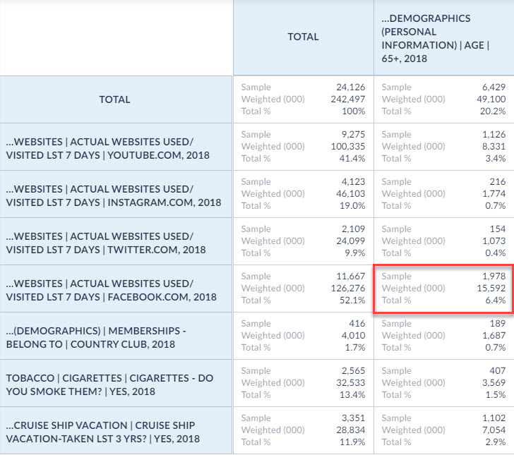
Sample - The number of respondents to the Simmons NCS Survey aged 65+ who have used Facebook in the past 7 days
Weighted - 15,592,000 is the estimated number of adults in the USA aged 65+ who have used Facebook in the past 7 days
Total % - Adults aged 65+ who have used Facebook in the past 7 days are 6.4% of the total population of the US
You will also notice that there is a Total column that cannot be removed. This is really helpful in understanding the total values across the entire survey.
And, that’s all there is to it! Thank you for reading this in depth overview of the crosstab functionality in SimplyAnalytics. We can’t wait to see what interesting crosstabs you come up with! Feel free to email us at any time with your questions or issues at: support@simplyanalytics.com
More from SimplyAnalytics
Posted on Oct 24, 2019 by Admin
Hi everybody! This week we wanted to bring you something unique, so we’re taking you behind the scenes to show you what goes in to setting up the SimplyAnalytics conference booth you’ve c...
Posted on Dec 03, 2012 by Admin
Come visit the Geographic Research booth at the Ontario Library Association Super Conference this season. The conference will take place on January 30 - February 2, 2013 at the Metro Toro...
Posted on Oct 07, 2024 by Admin
We're headed to Charleston! Come visit the SimplyAnalytics team on November 12th at the Gaillard Center at booth 41. We'll be doing live demonstrations of the database, answering question...
Posted on Jul 30, 2015 by Admin
One great feature within SimplyMap is the ability to track the same variable across multiple years. In this report, we will track the percentage of households in the US ordering items fro...
Posted on Apr 30, 2020 by Admin
We find ourselves in the middle of an unprecedented crisis the likes of which most of us have never experienced before, and hopefully won’t have to experience again. There is the occasion...
Posted on Sep 05, 2019 by Admin
We are pleased to be exhibiting again at the Charleston Library Conference, on Tuesday November 5th, 2019. The Vendor Showcase will be held in the Gaillard Center Grand Ballroom (95 Calho...
Posted on Feb 27, 2009 by Admin
Geographic Research, Inc. is pleased to participate in the Statewide California Electronic Library Consortium's (SCELC) 12th Annual Vendor Day. SCELC members and librarians from other aca...
Posted on Apr 21, 2015 by Admin
In this week’s edition of exploring SimplyMap data, we spotlight the Consumer Buying Power® data package in SimplyMap. What is it? The Nielsen Consumer Buying Power® database incorporates...
Posted on Apr 18, 2017 by Admin
We look forward to attending the Texas Library Association Conference this week in San Antonio and visiting with the library community. Stop by our new SimplyAnalytics booth (2029) and ta...
Posted on May 18, 2015 by Admin
The SimplyMap team is looking forward to visiting with customers and others at the SLA Annual Conference, coming to Boston on June 14-16. Come visit us at Booth #916, we are happy to answ...