


Exploring SimplyMap Data: PRIZM® Premier
Posted on Jun 09, 2016 by Admin
In this week’s blog, we’ll be featuring our newest data offering, PRIZM® Premier. If your institution currently subscribes to PRIZM data, this new module is available at no additional cost.
What is PRIZM® Premier?
Nielsen PRIZM® Premier is the latest evolution of Nielsen’s industry-leading consumer segmentation system. New factors in the PRIZM® Premier model are measures of technology behavior and household assets. The introduction of these key drivers enables you to create segments that reflect how today’s households have embraced technology and how they have weathered the economic shifts in recent years.
PRIZM Premier defines every U.S. household as one of 68 demographic and behavior types, or segments, to help marketers discern those consumers’ likes, dislikes, lifestyles and purchase behaviors. By segmenting consumer households along these lines, you will be better able to reach and retain your most profitable customers and tailor messages and products that resonate with them. PRIZM® Premier data is available for the current year and five-year estimates.
PRIZM Premier in Action
Let’s identify the top segments within a few cities across the United States so we can analyze the segments for each city and how they might differ from one another.
Raleigh, NC
New Orleans, LA
Austin, TX
Miami, FL
To identify top segments requires a simple two step process: first, you need to add all of the PRIZM segment variables to a Standard Report, and secondly you need to sort the respective columns. Let’s get started.
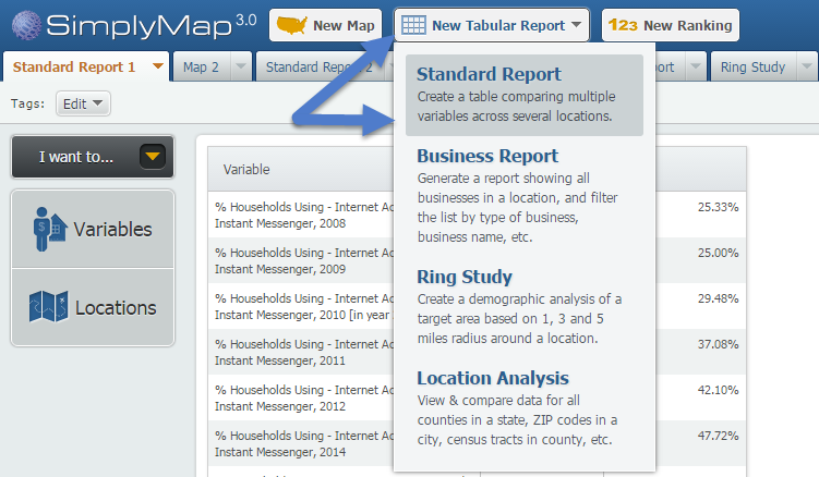
First, select New Tabular Report > Standard Report from the top of SimplyMap.
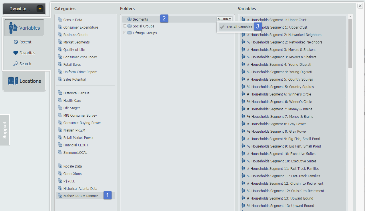
Next, open the Variables panel and navigate to the Nielsen PRIZM® Premier folder. Hover over the Segments folder and select Add All Variables from the Action dropdown that appears. Close out the panel to generate your report for the United States.
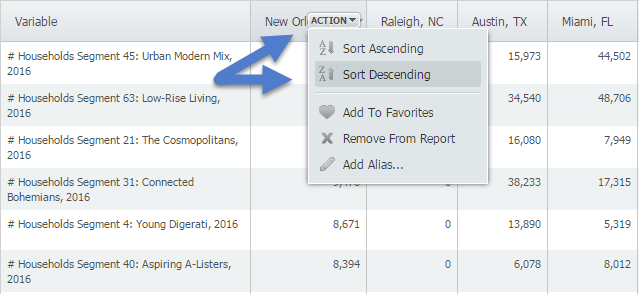
Lastly, click on the Locations panel and begin adding your cities for analysis. To identify the top segment within each city, hover over the location and select Sort Descending - this will bring the top segment numbers to the top, and scrolling further down will also reveal percentages to help normalize the data between cities.
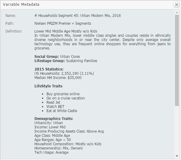
The metadata for each top segment is below! Check it out and let us know what you think.
New Orleans - Segment 45: Urban Modern Mix
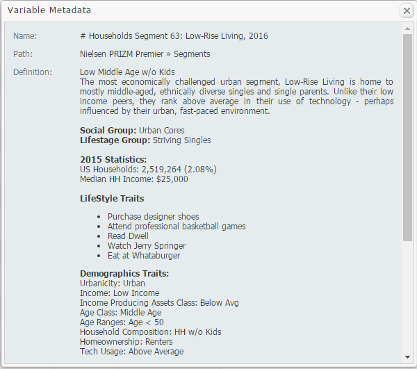
Miami - Segment 63: Low-Rise Living
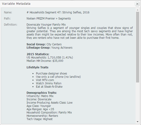
Raleigh - Segment 47: Striving Selfies
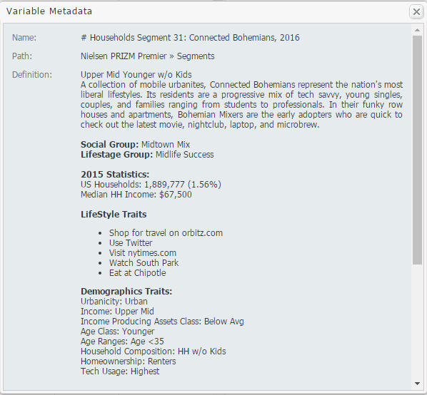
Austin - Segment 31: Connected Bohemians
Unique top segments to represent these unique cities in America. We hope you enjoyed this week’s SimplyMap report. Stay tuned for more tips and tricks!
More from SimplyAnalytics
Posted on Jul 22, 2015 by Admin
In this week’s SimplyMap report, we take a look at one of our newly available data packages - ConneXions® from Nielsen. The ConneXions® segmentation system integrates consumer behavior an...
Posted on Mar 02, 2018 by Admin
In this week’s blog we’ll take a look at how to enter an address in SimplyAnalytics to find the Census Block Group or Census Tract. Let’s get started! Use Case: You want to analyze the ar...
Posted on Apr 10, 2015 by Admin
In this week’s SimplyMap report, we explore one of the newer datasets available: Retail Market Power®. What is it? In short, the Retail Market Power® dataset helps users identify opportun...
Posted on Oct 29, 2015 by Admin
Did you know that SimplyMap allows you to search for businesses by NAICS or SIC codes? Searching by these codes is a great alternative to the general keyword search. Using the keyword sea...
Posted on Sep 08, 2016 by Admin
One of our favorite uses of SimplyMap is to find data that validates our general assumptions and observations. For example, in a previous blog we wrote about the growth of tablet ownershi...
Posted on Jan 15, 2013 by Admin
The GRI team is looking forward to exhibiting at ACRL 2013 at the Indiana Convention Center in Indianapolis April 10 - 12, 2013. Every other year, ACRL offers its premier professional dev...
Posted on Sep 07, 2011 by Admin
Geographic Research will be exhibiting and presenting during a vendor showcase session at the upcoming North Carolina Library Association (NCLA) Biennial Conference, October 4-7, 2011 in ...
Posted on Sep 01, 2008 by Admin
The King County Library System in Washington State now subscribes to SimplyMap, and has published a brief review on their blog, Library Talk.
Posted on Jan 05, 2018 by Admin
The SimplyAnalytics team is looking forward to exhibiting at the Ontario Library Association Super Conference 2018! Stop by the SimplyAnalytcs booth (115T) and take a look at our newest o...