 Go up
Go up


Exploring SimplyMap Data: Biking to Work in the US
Posted on Jul 09, 2015 by Admin
In this week’s SimplyMap report, we set out to find which cities have the highest percentages of people who use their bike as their mode of transportation to work in the US. Let’s get started!
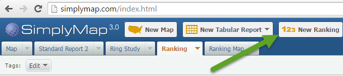
1. Create a new Ranking Report by selecting “New Ranking” at the top of Simply Map:
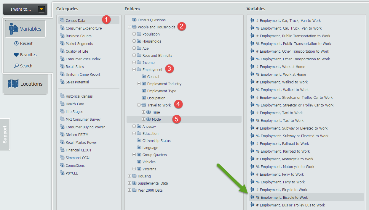
2. Select the variable to rank. Follow this path to find the % Employment, Bicycle to Work, 2014 variable: Census Data » People and Households » Employment » Travel to Work » Mode. Image below for reference.
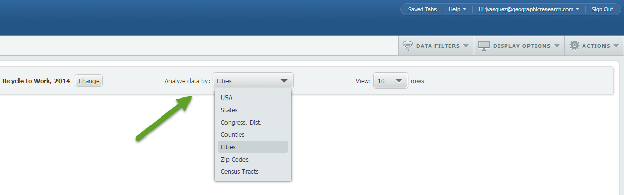
3. Open the Locations panel and choose USA as your geography. Close out the Locations panel to generate your report. Use the “Analyze data by” tool to select cities.
Because our variable is using a percentage, the ranking report may produce results skewed towards cities with a smaller population. To address this, we can quickly apply a data filter to only show cities with a population greater than 50,000.
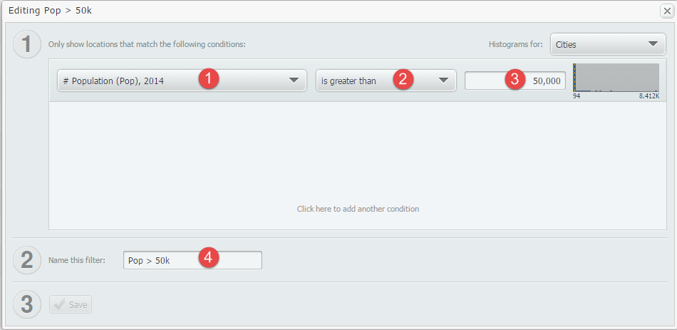
Favorite the variable titled, # Population (Pop). This can be found here: Census Data » People and Households » Age » Total. Return to your report, and select Create New Filter from the Data Filters Dropdown towards the top right. Follow the steps below to create and apply the filter:
- Scroll down on the variables dropdown to the Favorites list. Select # Population (Pop)
- Set the second dropdown to be “is greater than”.
- Enter 50,000 into the value field.
- Name the filter
- Save
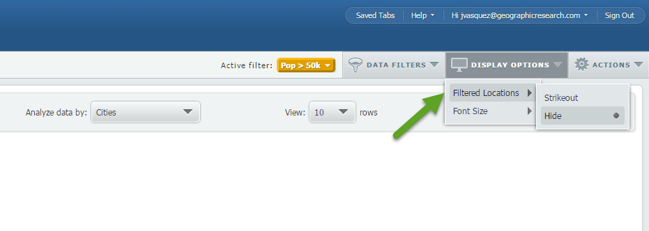
Once applied, your new report will be generated to show only cities that have a population greater than 50,000. Cities that don’t meet this criteria will be displayed with a strikethrough. To hide this, click on Display Options > Filtered Locations > Hide to see your final list.
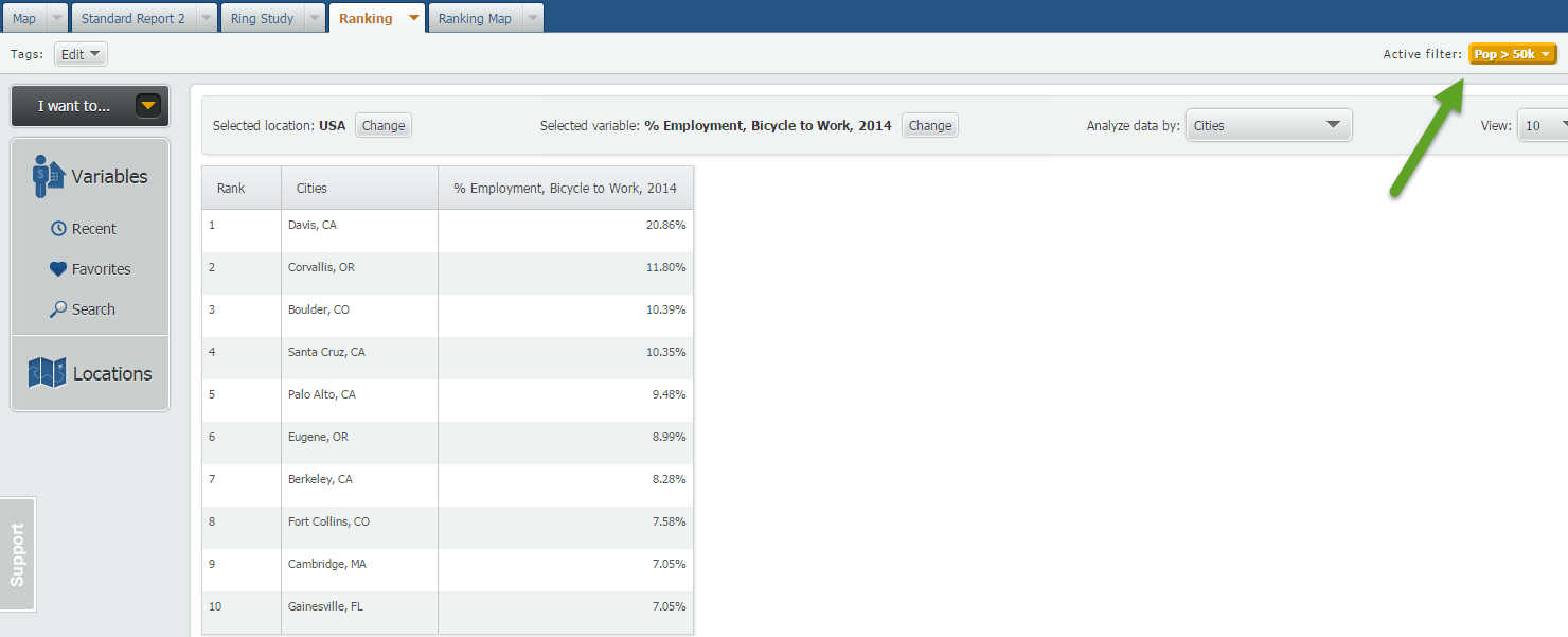
Davis, CA takes home the distinction of having the most bike to work commuters in the United States. A little research on Wikipedia reveals that Davis, CA’s motto is: Most Bicycle Friendly Town in the World. Our results here seem to prove that motto (at least in the US)!
Stay tuned for more SimplyMap reports and tips!
More from SimplyAnalytics


Posted on Oct 29, 2015 by Admin
Did you know that SimplyMap allows you to search for businesses by NAICS or SIC codes? Searching by these codes is a great alternative to the general keyword search. Using the keyword sea...
Posted on May 26, 2020 by Admin
Hello readers! We hope you are doing well, and thank you for your continued support of SimplyAnalytics. We are excited to announce that scatterplots are officially live! Scatter plots ar...
Posted on Nov 06, 2019 by Admin
Hello readers! We hope you’re having a wonderful week. Today we feature another entry from our From the Help Desk series. Let’s get started! Question: How do I analyze data for downtown? ...
Posted on May 15, 2015 by Admin
In this week’s SimplyMap report, we want to share with you the many options available when exporting maps in SimplyMap. In SimplyMap, when a user selects Export Map Image from the Actions...
Posted on May 06, 2013 by Admin
The GRI team is looking forward to exhibiting at SLA 2013 at the San Diego Convention Center, June 9th through the 11th. The Special Libraries Association (SLA) is a nonprofit global orga...
Posted on Oct 08, 2008 by Admin
Geographic Research, Inc. (GRI) is pleased to sponsor the fourth annual American Collegiate Retailing Association’s Undergraduate Student Retail Analysis Competition. This is the second ...
Posted on Jul 30, 2015 by Admin
One great feature within SimplyMap is the ability to track the same variable across multiple years. In this report, we will track the percentage of households in the US ordering items fro...
Posted on Jun 11, 2026 by Admin
SimplyAnalytics is excited to exhibit at ALA Annual 2026 in Chicago! Visit us at Booth #4336 to meet our team, ask questions, and learn more about the latest SimplyAnalytics features and ...
Posted on Sep 08, 2016 by Admin
One of our favorite uses of SimplyMap is to find data that validates our general assumptions and observations. For example, in a previous blog we wrote about the growth of tablet ownershi...
Posted on Jul 28, 2013 by Admin
We recently discovered some interesting data on participation and attitudes towards recycling, and decided to dig a bit deeper into our Experian SimmonsLOCAL data. This data package inclu...